You signed in with another tab or window. Reload to refresh your session.You signed out in another tab or window. Reload to refresh your session.You switched accounts on another tab or window. Reload to refresh your session.Dismiss alert
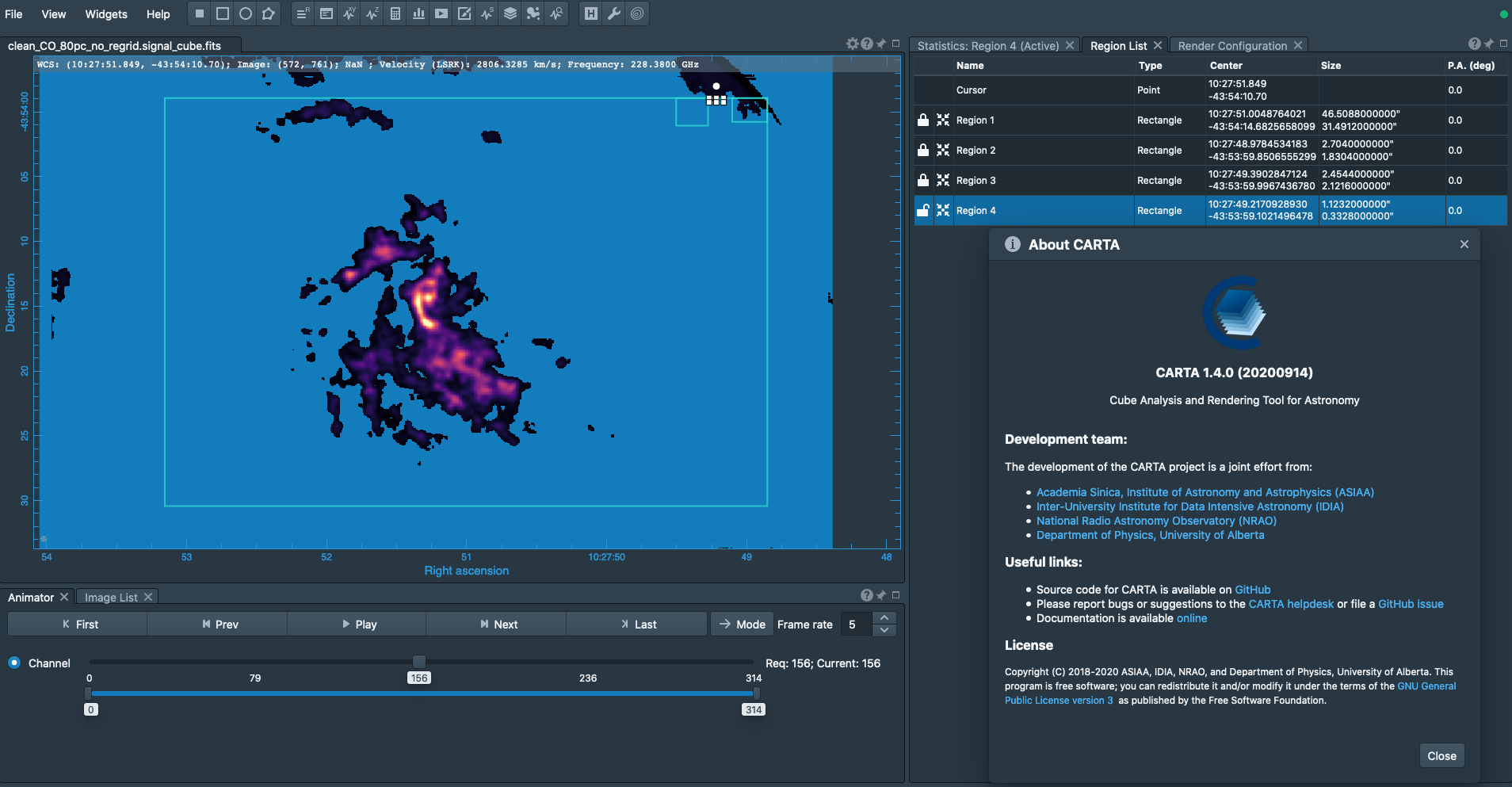
My real complaint here is that the white squares on regions that show where you can grab the region and adjust it actually get in the way of what I'm viewing in the image quite often. This is really obvious with a large image and a small region, where the squares completely block what is in and around the region like in the top-right of the image panel in this screenshot.
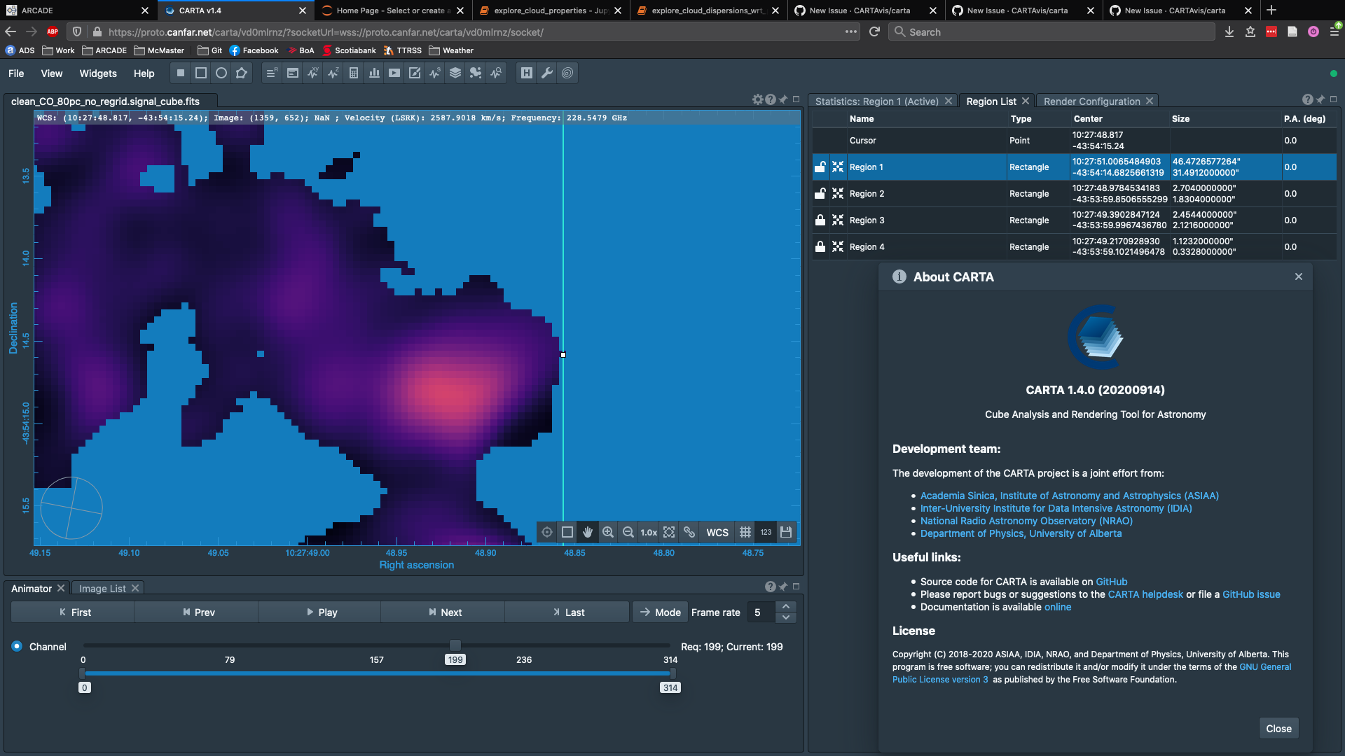
It can also happen when zoomed in quite far, trying to find the edge of a region but the square covers the pixels you're trying to view like in this screenshot.
A quick suggestion would be to use "marching ants" to indicate a region is active and use "hollow" handles to resize regions, like most graphics editing software does (e.g. Gimp).
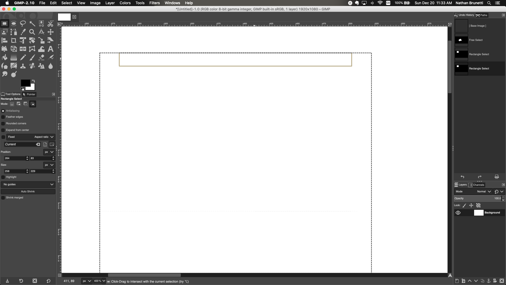
My broader suggestion though is to just mimic most/all of the region/selection visualizations they use in Gimp. They have clearly thought a lot about quality of life, intuitiveness, and functionality for this kind of stuff already. For example, the way the rectangular and ellipsoidal selection handles are naturally along the entire length of each side (see below) would also fix #52 .
I can get much more specific if that would help. I just didn't want to sink too much time into explaining all of this without knowing if there is interest in working on this. I also know my way around Gimp pretty well so I can help explain how they have approached regions, if people are unfamiliar with it.
The text was updated successfully, but these errors were encountered:
My real complaint here is that the white squares on regions that show where you can grab the region and adjust it actually get in the way of what I'm viewing in the image quite often. This is really obvious with a large image and a small region, where the squares completely block what is in and around the region like in the top-right of the image panel in this screenshot.
It can also happen when zoomed in quite far, trying to find the edge of a region but the square covers the pixels you're trying to view like in this screenshot.
A quick suggestion would be to use "marching ants" to indicate a region is active and use "hollow" handles to resize regions, like most graphics editing software does (e.g. Gimp).
My broader suggestion though is to just mimic most/all of the region/selection visualizations they use in Gimp. They have clearly thought a lot about quality of life, intuitiveness, and functionality for this kind of stuff already. For example, the way the rectangular and ellipsoidal selection handles are naturally along the entire length of each side (see below) would also fix #52 .
I can get much more specific if that would help. I just didn't want to sink too much time into explaining all of this without knowing if there is interest in working on this. I also know my way around Gimp pretty well so I can help explain how they have approached regions, if people are unfamiliar with it.
The text was updated successfully, but these errors were encountered: