渐变分为:
- linear-gradient
- radial-gradient
- repeating-linear-gradient
- repeating-radial-gradient
渐变可以用于任何设置图像的属性上面,比如:
background: linear-gradient( white, gray );
list-style-image: line-gradoent( circle, #006, #0000af 100%, white 100%);
-webkit-旧语法:
-webkit-gradient(<type>,<point>[,<radius>]?,<point>[,radius]?<stop>*)
-webkit-新语法:
-webkit-linear-gradient([<point>||<angle>]?<stop>,<stop>[,stop]*)
其他引擎的语法和-webkit-语法一致,只是前缀不同,只需带上相应的前缀即可:-ms-,-o-,-moz-。
标准语法:
linear-gradient([[<angle> | to <side-or-corner>],]?<color-stop>[,<color-stop>]+);
可以有如下方式设置渐变:
// 省略方向,默认从上到下
background: linear-gradient( red, orange );
// 方向是关键字,加上to
background: linear-gradient( to top, red, orange );
// 方向是角落(corner),加上to
background: linear-gradient( to top left, red, orange );
// 方向是角度,顺时针方向
background: linear-gradient( 45deg, red, orange );
// 角度也可以是负的
background: linear-gradient( -45deg, red, orange );
// 可以设置颜色的位置比例
background: linear-gradient( to bottom, reg 0%, orange 100% );
其中,如果是角度的话,其规则如图所示:
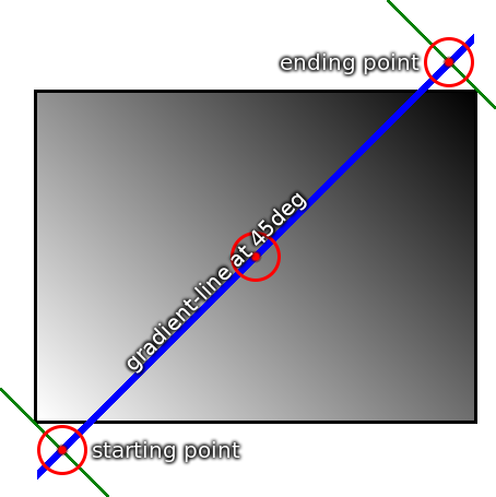
以box的中点为原点做圆,顺时针计算角度值。白色在box的左下角,黑色集中在box的右上角,尽管途中的蓝色线条没有经过左下角与右上角。
<iframe style="width: 100%; height: 1300px" src="http://img.youthol.top/css3/css3-linear-gradient-demo.html" allowfullscreen="allowfullscreen" frameborder="0"></iframe>