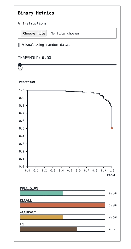
This is a svelte component for visualizing the metrics of a binary classifier as a function of the classification threshold. Sliding the threshold slider will update the location on the PR-curve, and the metric bars. Playing with it will give you a visceral sense of how much of each you are trading for the others. Machine learning engineers can have nice things too.
Right now, the project is unlicensed. You're free to use it for learning and study, but not to build things with it. I may get around to making it more consumable.
Here's what the thing looks like:
The app is hosted at standard.dev/binary-metrics, and you may use it there. All the data stays in the browser, and nothing is logged by the app (except a visit to the page).
If you'd like to play with the component on your own machine, you can clone the repo, run npm install in it, then npm run dev to serve an app containing the component.
The app can run on your own classification data. It expects a JSON document which is an array of objects, each with a probability (between zero and one) and label (either zero or one).
Something like this:
[
  {
    "probability": 0.10,
    "label": 0
  },
  {
    "probability": 0.46,
    "label": 1
  },
  ...
]
The demo data included in the app was generated with the fake-classification-data repo. Here's an example going from a scikit-learn classifier (trained on dummy data) to the necessary JSON format for consumption by the app:
X, y = make_classification(n_classes=2, n_samples=1000)

X_train, X_test, y_train, y_test = train_test_split(X, y)

model = LogisticRegression()
model.fit(X_train, y_train)

# extract probabilities of class 1
probabilities = model.predict_proba(X_test)[:, 1].tolist()

labels = y_test.tolist()

results = [
    {"probability": probability, "label": label}
    for (probability, label) in zip(probabilities, labels)
]

with open("data/predictions.json", "w") as f:
    json.dump(results, f)