-
Notifications
You must be signed in to change notification settings - Fork 6
/
Copy pathhtml_columns.md
262 lines (230 loc) · 7.67 KB
/
html_columns.md
1
2
3
4
5
6
7
8
9
10
11
12
13
14
15
16
17
18
19
20
21
22
23
24
25
26
27
28
29
30
31
32
33
34
35
36
37
38
39
40
41
42
43
44
45
46
47
48
49
50
51
52
53
54
55
56
57
58
59
60
61
62
63
64
65
66
67
68
69
70
71
72
73
74
75
76
77
78
79
80
81
82
83
84
85
86
87
88
89
90
91
92
93
94
95
96
97
98
99
100
101
102
103
104
105
106
107
108
109
110
111
112
113
114
115
116
117
118
119
120
121
122
123
124
125
126
127
128
129
130
131
132
133
134
135
136
137
138
139
140
141
142
143
144
145
146
147
148
149
150
151
152
153
154
155
156
157
158
159
160
161
162
163
164
165
166
167
168
169
170
171
172
173
174
175
176
177
178
179
180
181
182
183
184
185
186
187
188
189
190
191
192
193
194
195
196
197
198
199
200
201
202
203
204
205
206
207
208
209
210
211
212
213
214
215
216
217
218
219
220
221
222
223
224
225
226
227
228
229
230
231
232
233
234
235
236
237
238
239
240
241
242
243
244
245
246
247
248
249
250
251
252
253
254
255
256
257
258
259
260
261
---
layout: post
title: New Post
permalink: new-page.html
description: Some Description
date: 2016-01-14 13:22:52 +08:00
tags: "some tags here"
---
# HTML之多列布局CSS实现
在网页布局中一种普遍常见的布局方式是行列布局,比如三行三列或三行两列布局,此篇我们重点讲述HTML布局之多列布局的CSS实现。
**[本篇文章相关代码演示点此](http://jhssdemo.duapp.com/demo/html_columnslayout/index.html)**
**[本篇文章相关代码下载点此](https://github.com/codingplayboy/javascriptDemo/blob/master/h5_css/html_columnslayout.html)**
## inline-block与多列布局
inline-block是内将元素样式指定为行内内联样式。
> CSS中通过display:inline-block对一个对象指定inline-block属性,可以将对象呈递为内联对象,但是对象的内容作为块对象呈递。
在生成网页导航列表时,常常使用display:inline-block;实现;在多列布局中,其也有一定效果。
```
<!doctype html>
<html>
<head>
<style>
.left2 {
width: 200px;
height: 100px;
background-color: green;
display: inline-block;
}
.right2 {
width: 60%;
height: 100px;
background-color: red;
display: inline-block;
}
</style>
<head>
<body>
<h2>行内布局使用inline-block</h2>
<div class="left2">Left</div>
<div class="right2">Right</div>
</body>
</html>
```
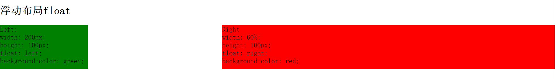
## 浮动float与多列布局
float 属性定义元素在哪个方向浮动。
> 使用float设置元素浮动后,元素会脱离文档流,左右浮动,而浮动元素原所在位置由后续非浮动元素填充,若浮动元素与后续非浮动元素发生重叠,则浮动元素将覆盖非浮动元素。
```
<!doctype html>
<html>
<head>
<style>
.left3 {
width: 200px;
height: 100px;
float: left;
background-color: green;
}
.right3 {
width: 60%;
height: 100px;
float: right;
background-color: red;
}
</style>
<head>
<body>
<div class="left3">Left
</div>
<div class="right3">Right
</div>
</body>
</html>
```
### 浮动float与margin正边距实现多列布局
以上使用inline-block或者float虽然可以实现多列布局,但是列宽度都是固定值,并无法做到自适应,于是我们使用float与margin正边距实现包含固定宽度列以及自适应宽度列的多列布局。
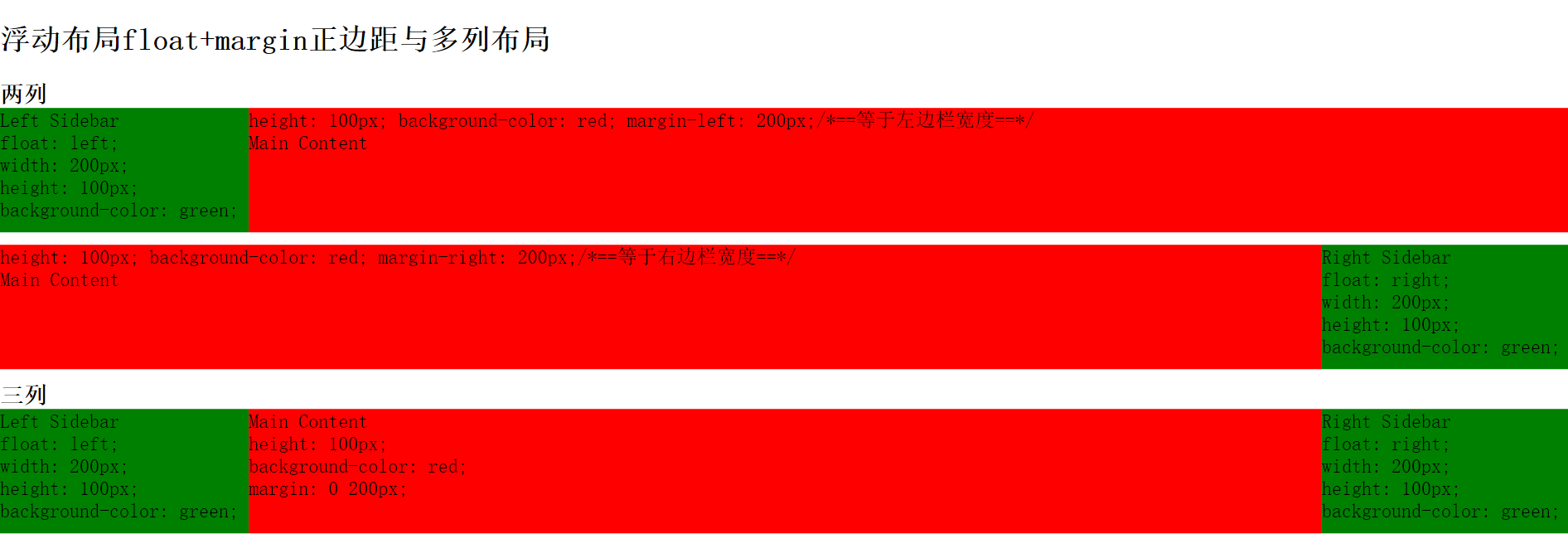
```
<!doctype html>
<html>
<head>
<style>
#left {
float: left;
width: 200px;
height: 100px;
background-color: green;
}
#contentL {
height: 100px;
background-color: red;
margin-left: 200px;/*==等于左边栏宽度==*/
}
#right {
float: right;
width: 200px;
height: 100px;
background-color: green;
}
#contentR {
height: 100px;
background-color: red;
margin-right: 200px;/*==等于左边栏宽度==*/
}
#contentLR {
height: 100px;
background-color: red;
margin: 0 200px;
}
</style>
<head>
<body>
<h2>浮动布局float+margin正边距与多列布局</h2>
<h3>两列</h3>
<div id="left">Left
</div>
<div id="contentL">
<div id="contentInner">
Main Content
</div>
</div>
<div class="clear"></div>
<div id="right">
Right Sidebar
</div>
<div id="contentR">
<div id="contentInner">
Main Content
</div>
</div>
<div class="clear"></div>
<h3>三列</h3>
<div id="left">
Left Sidebar
</div>
<div id="right">
Right Sidebar
</div>
<div id="contentLR">
<div id="contentInner">
Main Content
</div>
</div>
</body>
</html>
```
**如上,使用float设置元素左右浮动为基础,再对非浮动的自适应宽度列使用margin-left与margin-right使自适应宽度列与浮动的定宽列形成多列布局。**
*注,定宽列为浮动元素,自适应宽度列设置margin-left和margin-right,其值分别为左浮动元素和右浮动元素列的宽度。*
*此方法适用于Chrome,Firefox,Opera和IE5+*
### 浮动float与margin负边距实现多列布局
上一例为使用float+margin正边距实现含自适应宽度列的多列布局,其实使用float与margin负边距也可以实现包含固定宽度列以及自适应宽度列的多列布局。
```
<!doctype html>
<html>
<head>
<style>
.mainL, .sitebarL, .mainR, .sitebarR {
height: 200px;
font: bolder 20px/200px '微软雅黑';
color: #fff;
text-align: center;
}
.mainL {
width: 100%;
float: left;
}
.mainR {
width: 100%;
float: right;
}
.mainL .contentL {
height: 100%;
margin-right: 200px;
background-color: red;
}
.mainR .contentR {
height: 100%;
margin-left: 200px;
background-color: red;
}
.contentLR {
height: 100%;
margin-left: 200px;
margin-right: 200px;
background-color: red;
}
.sitebarL {
width: 200px;
float: left;
margin-right: -100%;
background-color: green;
}
.sitebarR {
width: 200px;
float: right;
margin-left: -100%;
background-color: green;
}
.clear {
width: 100%;
clear: both;
height: 10px;
}
</style>
<head>
<body>
<h2>浮动布局float+margin负边距与多列布局</h2>
<div class="sitebarL">左侧定宽200px区块</div>
<div class="mainR">
<div class="contentR">右侧主体自适应区块</div>
</div>
<div class="clear"></div>
<div class="mainL">
<div class="contentL">左侧主体自适应区块</div>
</div>
<div class="sitebarR">右侧定宽200px区块</div>
<div class="clear"></div>
<div class="sitebarL">左侧定宽200px区块</div>
<div class="mainL">
<div class="contentLR">主体自适应区块</div>
</div>
<div class="sitebarR">右侧定宽200px区块</div>
<div class="clear"></div>
</body>
</html>
```
**如上,此方式基本上还是以float设置元素左右浮动为基础,分别为左浮动元素和右浮动元素设置margin-right:-100%;和margin-left:-100%;使得自适应宽度列能填充浮动元素之前所占据文档流的位置,而在两者重叠的位置,如上文所说,浮动元素会覆盖非浮动元素,于是就实现了有固定宽度列以及自适应宽度列的多列布局。**
*注:实际上只要为浮动元素设置margin-left或margin-right值的绝对值大于浮动元素列宽度即可实现含自适应宽度列的多列布局。*
*注:左浮动元素设置margin-right:-100%;右浮动元素设置margin-left:-100%;以使自适应宽度列能填充其浮动前所占的文档流中位置。*
*此法适用于Chrome,Firefox,Opera和IE8+*