Added FileSelector widget #909
Conversation
|
Can you add an example to the docs to make it easier to try out? |
|
Done. |
Codecov Report
@@            Coverage Diff             @@
##           master     #909      +/-   ##
==========================================
+ Coverage   85.33%   85.61%   +0.28%
==========================================
  Files          96       98       +2
  Lines       10772    10996     +224
==========================================
+ Hits         9192     9414     +222
- Misses       1580     1582       +2
Continue to review full report at Codecov.
|

4946713 to
ad8bc2d
Compare
|
This looks really useful! I was part of the design of this CrossSelector-based interface for multiselection years ago, so I'm not blaming anyone but myself, but I definitely don't find it intuitive. Basically, the problem is that it's a selector, yet it's hard to figure out what's selected and how to use it. Specifically:
|
Seems very weird to me, back and forward traverse the stack of previously visited directories (just like your web browser or OS file browser), overloading that with some other semantics seems very odd. I also don't really see how that's any clearer tbh.
I think you've misunderstood back and forward, and that confusion shines through in a lot of these points, so I won't address the rest of your comments until you've had a chance to reevaluate with that understanding.
Sure, I agree.
I'd kind of like that to be supported, not straightforward though (*actually probably not too difficult).
Popups are definitely not trivial, I'm also not quite sure what you're imagining. I mean I can definitely just hide this behind a button, which expands it when needed. |
Certainly not the intended behavior! |
|
To summarize, I can agree that Home is somewhat redundant but I strongly disagree with combining back/forward with enter. I think most people are familiar with back/forward from their file/web browser and overloading it definitely seems strange to me. Enter is an annoyance but I don't see a better approach. Up can be useful because the back/forward stack can be very much out of order (which is I think the thing you were missing), the address bar lets you enter any path so back has no guarantee of bringing you one directory up. This is also why overloading forward with enter is so problematic. |
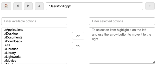
True, the cross-selector interface is not the most convenient. Would love to hear alternatives! The only approach I see is to add a placeholder which explains things to the box on the right. |
|
Suggestions for fixing the placeholder text welcome:
|
Ok, I see what you are getting at, but I don't think it changes anything. I'm focusing on the experience of people using the buttons, which is what I think normal people will do. It's fundamentally a Selector, not a free-text field; people will typically use it to Select using a mouse or touchpad from options they are given. Using the buttons in this way, I think it's always going to be a simple left-right stack along components of a single path. I.e. if I start at /Users/jbednar and use the Enter button three times to select bokeh, then examples, then models, I get to /Users/jbednar/bokeh/examples/models. Then Back goes to examples, then bokeh, and from there Forward goes to examples, then models. Using the buttons in this way I can just go left or right along one path at any one time, i.e. /Users/jbednar/bokeh/examples/models; I can't go sideways onto some other path. If you do type in arbitrary paths, then yes, that does let you get all out of order. But I don't think that's going to be a typical action people will take with this widget, and if they do, it seems just as likely that they would want to traverse the subcomponents of the path they pasted in as to traverse their history of pasting. It's not like a URL bar where people will keep it open and paste in new URLs all the time; that would be a different widget. This one is a selector, for selecting from displayed options, right? With that and the fact that every extra button makes a UI less discoverable and less obvious, I don't think it's worth having Home, because multiple clicks can always get back to it. And I still don't think it's worth having a separate and deeply confusing Return button. People coming up to this widget are going to immediately get frustrated by not being able to enter the highlighted subdirectory, and I think if they are presented with only two widgets Back and Forward, they are likely to intuit "maybe I should click Forward? (because it's surely not Back!)". With three widgets, one of which has a confusing "Return" symbol, I don't think people will intuitively click Return ("I'm not clicking on that one; I don't want to return anywhere!"). So though I agree it's a bit confusing to overload Forward, I think it's much more confusing to have a separate Return button, because I think people will figure out two buttons much more easily than three. |
|
BTW, part of the problem is that the symbol for Return is pointing backwards, and fundamentally entering a directory is to move forwards, not backwards. But you can't add another button pointing forwards, as Forward already does that. I don't think there's any graphical way to keep those two actions straight, so I propose that there is only one button for both types of "moving forward". I.e. if they can't be made clearly distinct; give up and just make one button for it! |
|
Okay, I get your point but I think making them look like back and forward keys is more confusing in that case because people are familiar with those from other file browsers. Up and down seems more appropriate in that case and getting rid of the whole notion of a stack/history. |
|
Sure, that makes sense; up and down are fine for this purpose. |
|
Okay so to list all the suggestions:
|
|
As for the lack of double click, I don't know why double-click won't work, so I'm not sure what to suggest. Double-click is the obvious action for entering a subdirectory or for "send this file to the right pane immediately" in this interface, and anything else is going to be awkward.
I'm pretty sure I suggested it in the first place, and even a couple of years later I don't think I have any better suggestions. It totally makes sense once you understand it, and makes no sense until you do. |
|
We didn't actually have a TextAreaInput until quite recently, which is the only way we can add the placeholder text. |
I'm not sure what you mean; doesn't the placeholder text originate with Crosselector? |

|
Yes, but I mean putting a longer placeholder in the actual select box on the right like shown here:
That's only possible by replacing the MultiSelect widget inside the cross-selector with a TextInputArea if no selection has been made. |

Can't actually reproduce this. |
|
Oh, I see what you mean now. Yes, adding text in the right-hand box would be a big, big help in making it clear what to do. In any case your to-do list sounds perfect.
Oops; I was confused. I thought it was selecting on the path because it selected all the files when I put in |
Can't reproduce this either, seems to behave as expected for me. |
|
I still kind of think back/forward can be useful but for now I've definitely removed home. I've also implemented the ability to select across directories, removed the The current state:
|

|
To reproduce:
It looks like a single leading |
Oh right, the filter uses a regex.match not a glob-like pattern. So |
Normally filename matching is done with globs, not regexes, so that will be surprising. In any case I don't see anything about regexes in the code, only globs, and even with a regex |
Have a look at the CrossSelector code: |
Co-Authored-By: James A. Bednar <[email protected]>
d91c529 to
630161b
Compare
|
Final design:
|

|
Looks great! |
Adds a
FileSelectorwidget that looks like this and allows browsing files on the server. It only allows browsing files in the specified directory so you cannot access restricted files. The UI isn't perfect since actions like a double click on a directory are not allowed so selecting a directory will update the path in the top bar and unlock the "Enter" button. Clicking that button will actually navigate to that directory. Selections are performed just like theCrossSelectorwidget. Also has additional buttons to go "home" (i.e. the initially specified directory), back and forth through the history and lastly to go up a directory.@jbednar @jlstevens Would be great if you could try this out and report back on UI changes you think would help.