Note: Below's notes are just summarizing Introduction - Android Wear - Android Wear design guidelines. Be sure to flip through those pages.
Android Wear 2.0 is all about 1-dimensional, vertical columns. Horizontal can still play a role, but it is secondary, and lives inline to the vertical column (think carousels).
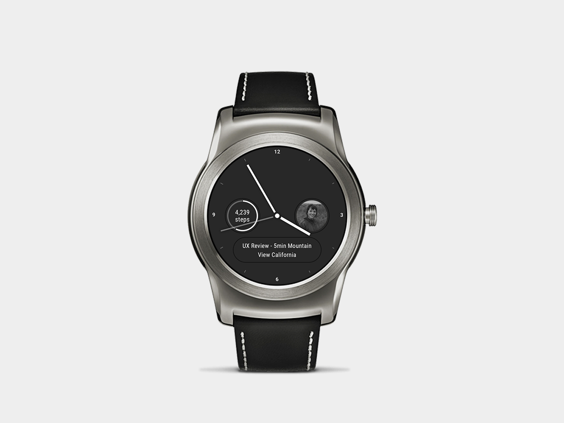
Your default column houses your Watch Face at the top, and any collapsed notifications below it.
Another nice example, showing Cool Circle watch face
Interactive watch faces - Patterns - Android Wear design guidelines for more
- A large icon (optional)
- An app icon
- A content title
- Content text
- Primary action
from Notifications - Patterns - Android Wear design guidelines
Upon clicking on a collapsed notification, you are taken to a new view/column: the expanded notification. To get back to the main column, swipe right. Imagine expanded notifications living in a column to the right of the main column.
- A content title
- An app name
- An app icon
- Content text
- A big picture (optional)
- Inline action: If you have a primary action in a collapsed notification, you should add the same action here.
- Smart replies: If the notification is MessagingStyle, the system can show smart suggestions
- Action drawer: Add any remaining notification actions in this area. The user can swipe up or tap the overflow icon to open the drawer.
from Notifications - Patterns - Android Wear design guidelines
An app is navigated to by a pre-programmed hardware key, by voice, or by the app launcher (shown below).
When it is active, its view takes over (much like an expanded notification), but has some additional components to leverage. Best to think of it as a Viewport layer at the lowest position, and two layers floating over it at the top position (Navigation Drawer) and bottom position (Action Drawer). Note: both drawers use a peek animation to inform the user of their existence.
- content (text, images, etc). See Content containers - System overview - Android Wear design guidelines for more.
- a optional, big Primary action button (hierarchically outside of content)
- and optional Inline action buttons - Components - Android Wear design guidelines shown after content (hierarchically inside of content)
If used, will have 2+ horizontal tabs that when actived change the Viewport. Much like tabs in your browser.
Can also be collapsed into a single page of multiple buttons.
A vertical sheet that, when expanded, includes additional actions.
from Android Wear: wear what you want, get what you need
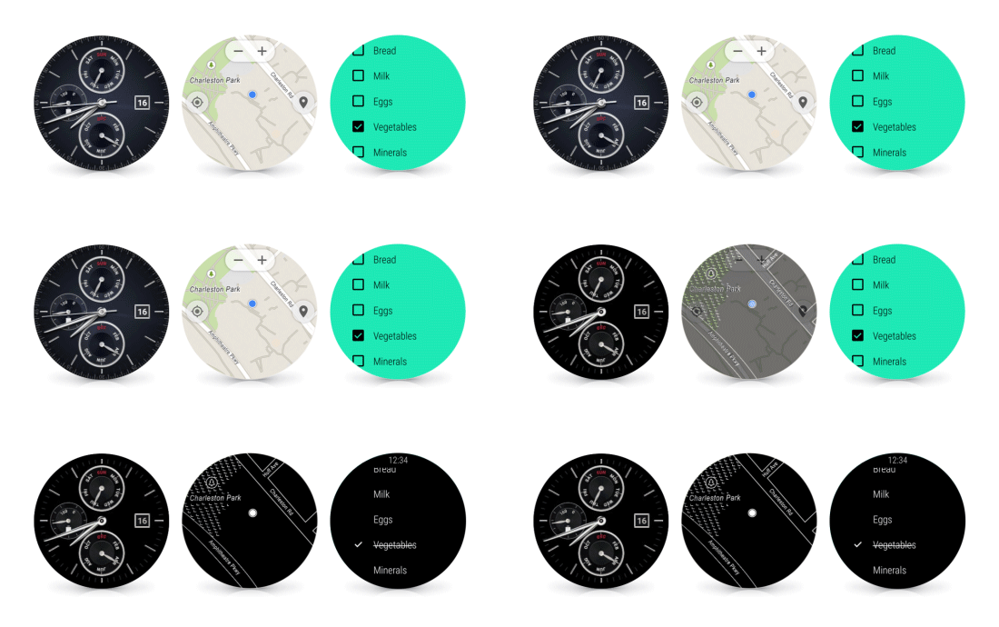
Shows all, bright colors and animations. You just pressed something to wake up the watch.
Dims screen to grayscale to conserve battery. The more black space on the screen, the more battery is saved.
Note: Apps can take advantage of this, too! No longer just the Face.
- By default your app in ambient mode only updates the screen every minute. This can be changed for time-sensative matters like timers and running apps.
- Read Keeping Your App Visible | Android Developers for more.
- Watch How to: Use Always-on Apps with Android Wear - YouTube for examples.
from Official Android Blog: Android Wear: Always-on apps
Another example of EveryDay Watch Face
- Watch this fake climbing app demonstrating many capabilities
- Apps can be built as
Standaloneand installed directly from watch, not needing a paired phone. This opens more doors for the iOS story.
- Watch Android Wear 2.0: Building Apps with Material Design - Google I/O 2016 - YouTube
- Creating and Running a Wearable App | Android Developers
- Building Apps for Wearables | Android Developers
- Watch What’s new with Notifications in Android N and Android Wear 2.0 - Google I/O 2016 - YouTube
- Adding Wearable Features to Notifications | Android Developers
- "Android Wear watch faces are services that are packaged inside a wearable app. When users select one of the available watch faces, the wearable device shows the watch face and invokes its service callback methods." - Building a Watch Face Service | Android Developers
- Interactive watch faces - Patterns - Android Wear design guidelines says only gesture allowed is single-tap, no swipes.
- Though this app has left/right scrolling to reveal more tappable content: Bubble Cloud Wear Launcher Watchface - Android Apps on Google Play
- I'm confused
- You'll likely want to plan for Complications
- From Actions to battery life, these updates will make Android Wear 2.0 even better
- "Did you also know that an all-white display can use up to seven times more power than a black display in interactive mode?"
- "It also wants developers to be smarter with design choices to reduce battery suck, including making use of ambient mode and using fewer animations"
- "did you know that Bluetooth is way more battery intensive than LTE or Wi-FI? Well it is, and Google wants developers to use the latter when possible to transfer data to Wear devices. It also wants developers to reduce the amount of vibrations and location checks."
- Android Wear tips and tricks: The hidden smartwatch secrets
- pin favorite apps by holding it down in the launcher for a second


