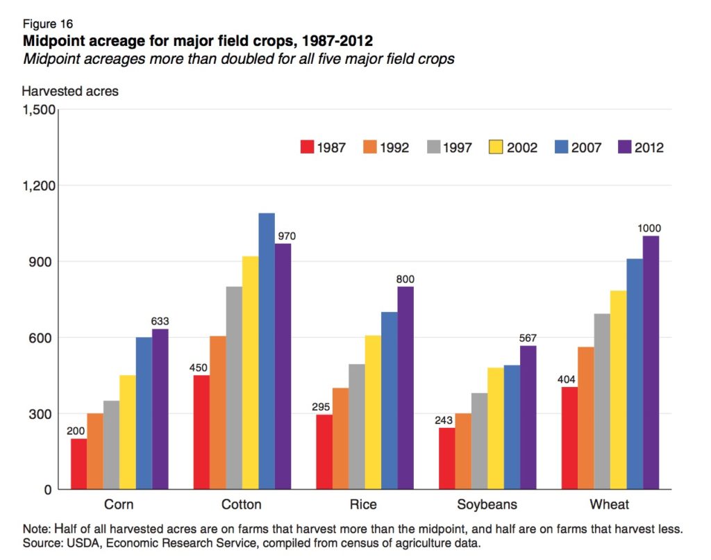
This page presents several examples of redesigning charts and considering the use of different idioms to better reflect the initial goals of the analysis.
Remake: Time Series Column Chart, PolicyViz.com, June 2018
| Original Chart | |
|---|---|
 |
Q: What's your first observation from this chart?
|
| Redesign 1: line chart | |
|---|---|
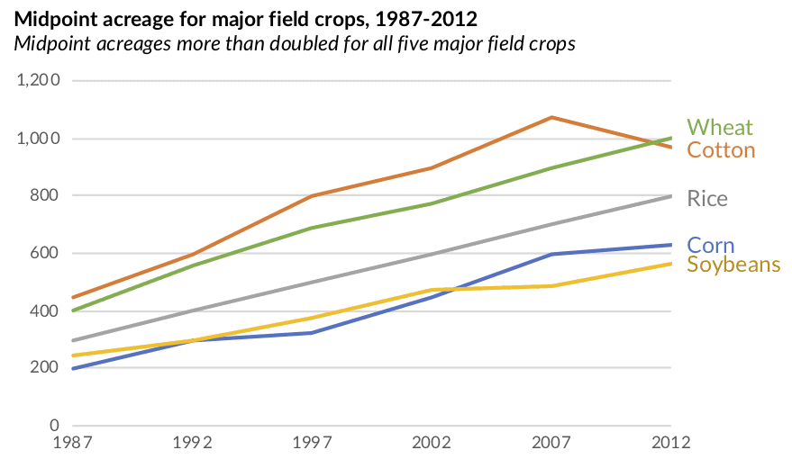 |
|
| Redesign 2: small multiples line chart (cycle chart) | |
|---|---|
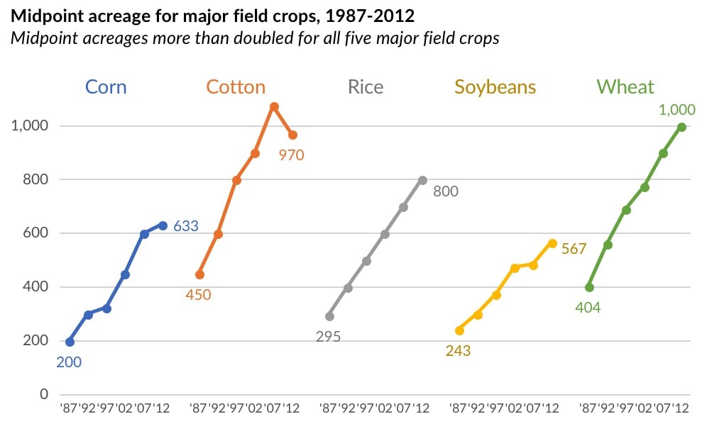 |
|
Q: Which do you prefer?
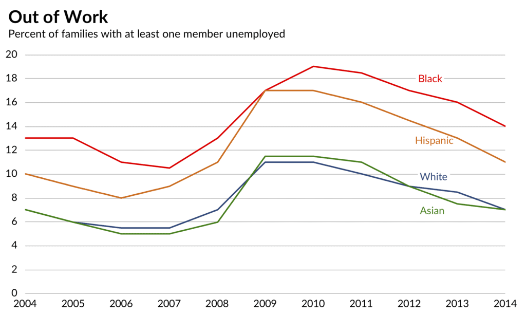
Remake: Paired Column Chart from WSJ, PolicyViz.com, March 2018
| Original Chart | |
|---|---|
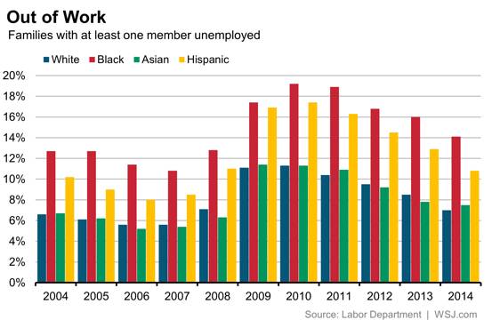 |
Compare unemployment rates within and between 4 different racial/ethnic groups between 2004-2014. Problems with this chart: too many columns |
| Redesign 1: line chart | |
|---|---|
 |
no legend, labels near each line |
| Redesign 2: small multiples line chart (cycle chart) | |
|---|---|
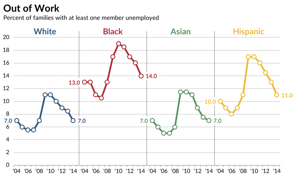 |
added data value for first and last point (makes clear that the unemployment rates for Whites and Asians did not change overall) |
Q: Which do you prefer?
Q: What other things do you see with either the line chart or cycle chart that are difficult to spot with the bar chart?
Remake: Stacked Column Chart from Merrill Lynch, PolicyViz.com, Feb 2018
| Original Chart | |
|---|---|
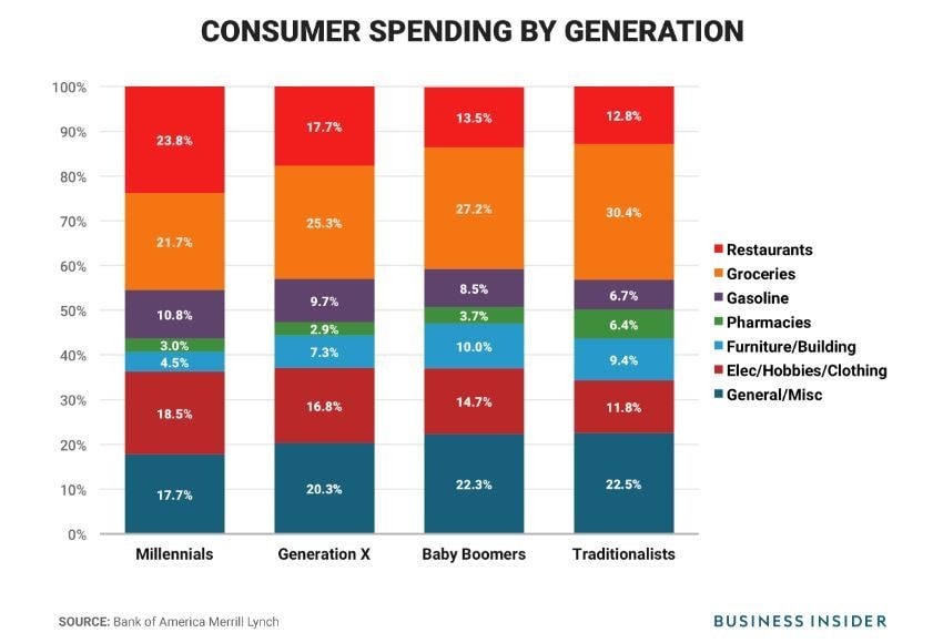 |
Shows distribution of spending across 7 categories by 4 generations of Americans. Could be changed:
Main points raised in accompanying text:
|
Q: How easy is it to see these points from the original chart?
NOTE: Category labels on original charts (in the blog post) are incorrect. I've included corrected versions here.
| Redesign 1: small multiples | |
|---|---|
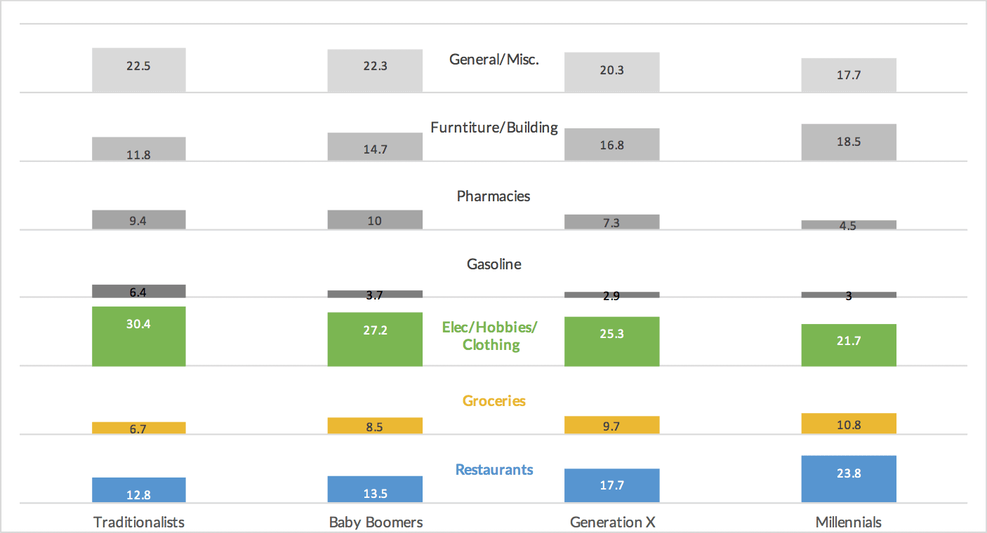 |
|
| Redesign 2: line chart | |
|---|---|
 |
|
| Redesign 3: pie chart | |
|---|---|
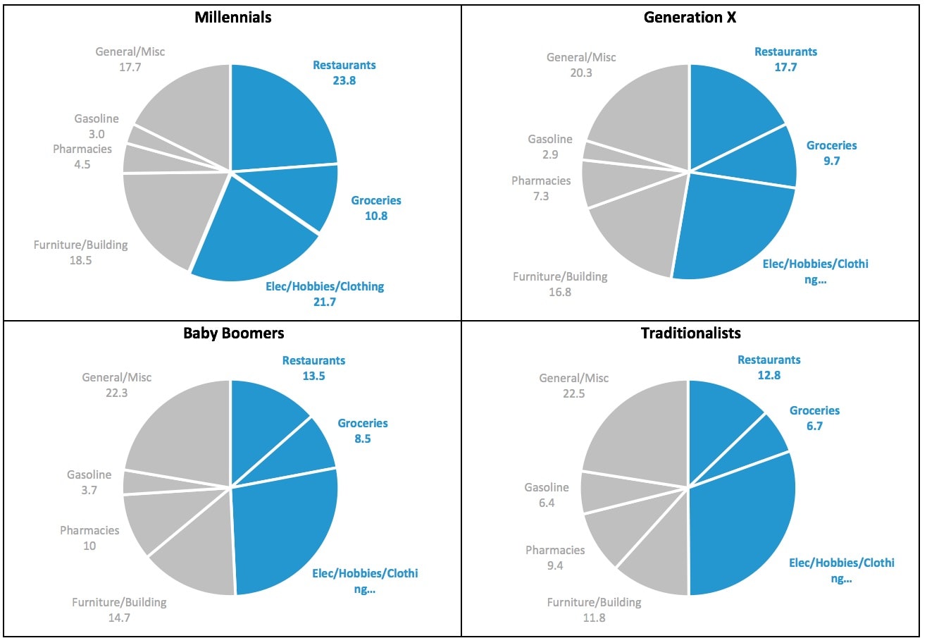 |
|
Final change - title
- "Consumer Spending by Generation" doesn't illustrate the main point
- “Millennials spend more at restaurants while older generations spend more at grocery stores” -- this is what you want viewers to take away from the chart
When Are 100% Stacked Bar Graphs Useful?, Stephen Few's blog, Jan 2016
Note: The comments section of this blog post contains an interesting conversation between Few and Cole Nussbaumer Knaflic (author of many of the "storytelling with data" blog posts).
| Original Chart | Redesign |
|---|---|
 |
 |
"When multiple 100% stacked bars appear in a graph, they only provide information about the parts of some whole, never about the wholes and how they differ. Therefore, they would never be appropriate when information about totals and the parts of which they are made are both of interest."
Few's position: "A 100% stacked bar graph never serves as the best solution for a time series. Stacked segments of bars do not display patterns of change through time as clearly as lines."
Nussbaumer Knaflic's position: " I like the intrinsic visual cue of the part-to-whole relationship and in this case think the trade-offs are worth it. In general, I don’t think there is a single 'right' or 'best' answer when it comes to visualizing data, rather different scenarios will call for different approaches and different individuals will make different design choices."
Q: How does the 100% stacked bar chart compare to the line chart shown in the article?
(According to Few) 100% stacked bar graphs are only useful in three specific situations:
| Examples | |
|---|---|
 |
When the bars consist of only two segments (e.g., male and female) |
 |
When we need to compare the sum of multiple parts among multiple bars |
 |
When we need to compare the percentages of responses to Likert scales |
declutter! (and question default settings), storytellingwithdata blog, May 2019
| Original Chart | |
|---|---|
 |
Shows percentage of babies born with a 24-hour period, broken down by day of the week. |
Q: What things would you change?
| Redesign | |
|---|---|
 |
Author's suggestions to change:
|