The "add another" button UX is upside down #18
Comments
|
@dchandekstark @mjgiarlo Can we change hydra-editor to do it like curate does? |
|
For reference the CSS is found here: https://github.com/ndlib/curate/blob/updating-sufia/app/assets/stylesheets/modules/multi_value_fields.css.scss And the JS is found here: https://github.com/ndlib/curate/blob/updating-sufia/app/assets/javascripts/manage_repeating_fields.js Should these be extracted to the tiniest of engine? |
|
@jeremyf for this ticket, I'd just copy the js (or just it's behavior) to hydra-editor. I'm not interested in changing our styling. |
|
👍 |
|
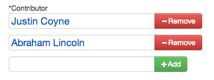
If we're not looking for different approaches to how one adds and removes fields, I think that having the add button at the bottom of the list would be better. If you are adding many additional fields, you have to go back up to the first field to click add–or just hit return. So since the user's focus is on the field that he/she is filling in with content, I think that it would be ideal to have the add button right there next to the last field. |
|
Agreed - the current convention of having the delete (-) next to the current field can lead to the user (i.e. me) inadvertently clicking on the button that deletes the term they just entered, when what they really wanted to do was add the next term. The arrangement suggested by this ticket is much kinder to the end-user. |
|
👍 |
When you add another, you want to type into the newly created field (at the bottom) and then click the button next to it to add the next one. But that is a remove button, not an add button.
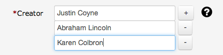
I think the way curate does it is better
The text was updated successfully, but these errors were encountered: