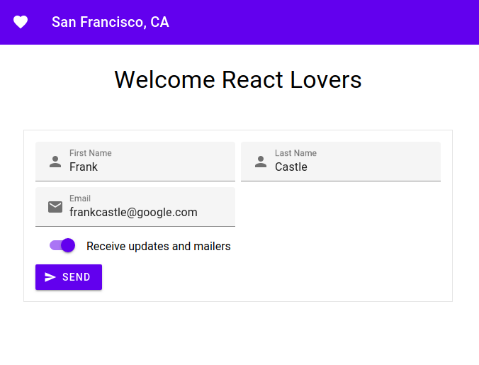
MDC React is the offical implementation of Google's Material Design Components. It is a wrapper library for MDC Web. Please refer to our MDC Web Catalog to play and interact with the Components.
The following is a list of the components that are ready to be used, with corresponding links to the material.io design spec and MDC Web code.
create-react-app is a popular CLI tool to getting started with React. If you're new to React or Webpack, you might be starting out here. This section will walk you through configuring create-react-app to install and use our components.
Recommended things to know
- node/npm
- JavaScript
- HTML/CSS
- ES6
NOTE: If you haven't used
create-react-appbefore, you may want to read the Overview Guide.
Install create-react-app:
npm i -g create-react-app
create-react-app my-app
cd my-app
NOTE: all npm commands can be replaced with yarn
Install Button:
npm install --save @material/react-button
If you want to use the compiled CSS and not customize any colors, text, etc. you can skip to Step 3a.
Most likely you'll want to start using the Sass mixins to customize your app. There are a few ways to achieve this. create-react-app does have a recommended approach, which we also recommend.
The following is an alternate version of the create-react-app approach. The difference being all the node_modules imports will go into ./src/App.scss. First install node-sass-chokidar:
npm install -D node-sass-chokidar npm-run-all
In package.json replace the following:
"scripts": {
  "start": "react-scripts start",
  "build": "react-scripts build",
  "test": "react-scripts test --env=jsdom",
  "eject": "react-scripts eject"
}
with:
"scripts": {
  "build-css": "node-sass-chokidar --include-path ./src --include-path ./node_modules ./src/App.scss -o ./src",
  "watch-css": "npm run build-css && node-sass-chokidar --include-path ./src --include-path ./node_modules --watch ./src/App.scss ./src/App.css",
  "start-js": "react-scripts start",
  "start": "npm-run-all -p watch-css start-js",
  "build-js": "react-scripts build",
  "build": "npm-run-all build-css build-js",
  "test": "react-scripts test --env=jsdom",
  "eject": "react-scripts eject"
}
Then rename ./src/App.css --> ./src/App.scss. The build-css and watch-css tasks will now watch App.scss file changes, which holds all your Sass imports. You can now import Sass files from node_modules like so:
// ./src/App.scss

@import "@material/react-button/index"; // the .scss extension is implied
@import "./react-button-overrides";

...
// ./react-button-overrides.scss
@import "@material/button/mixins";
.button-alternate {
@include mdc-button-container-fill-color(lightblue);
}
If you performed Step 3, then you can skip to Step 4.
If you don't need to customize your app, then using the CSS is a quicker way to get started with MDC React Components. Each package comes with a /dist directory, which includes the CSS files compiled from our Sass files. create-react-app is ready to import CSS files. To import the Button CSS copy the following line into ./src/App.js imports:
import '@material/react-button/dist/button.css';If you want to use the minified version, the import instead looks like:
import '@material/react-button/dist/button.min.css';Open ./src/App.js. Then replace the boilerplate App code (entire file) with the barebones MDC React Button:
import React, {Component} from 'react';
import Button from '@material/react-button/dist'; // /index.js is implied

import './App.css';
// add the appropriate line(s) in Step 3a if you are using compiled CSS instead.

class App extends Component {
  render() {
    return (
      <div>
        <Button
          raised
          className='button-alternate'
          onClick={() => console.log('clicked!')}
        >
          Click Me!
        </Button>
      </div>
    );
  }
}

export default App;
You can also use these same configurations for your own Webpack build pipeline without create-react-app. But this is the quickest way to getting started with MDC React Components. Button is one of our simpler components, but you should be able to apply these same principles you learn here to any the components. Thanks for trying out MDC React Components, and remember to tell a friend! Enjoy!
We're constantly trying to improve our components. If Github Issues don't fit your needs, then please visit us on our Discord Channel.

