[mediaqueries-5] high-contrast media feature #1286
Comments
|
Yes, I believe there is potential on this topic, and that we should address it. However, I do not believe it to be very simple. Primarily because
So, do we need 2 (or 12) completely separate queries to express all the various things that exist? 1 query with a bunch of values? Expose some higher level semantics? How? I've heard ideas on this topic, and have a few of my own, but I don't think we have firm conclusions yet. |
|
Absolutely. Having very detailed indication of what kind of high-contrast the OS/UA are actually using will be tricky. Was only thinking as a first stage having at least an on/off indicator, but agree that it's possibly of little practical use to devs beyond a basic "pick strong contrasting foreground/background color combinations" (which would still be strongly contrasted in situations where the color inversion is done at pixel/OS level, and would be replaced by OS' enforced colors in situations like Windows High Contrast). |
|
Not sure even that would help. For instance, OS X (at the system level) has two settings that work on boosting contrast: one that works at the pixel level, and one that is more content aware. The one that's content aware also adds (in the native UI at least) borders around things. If the high contrast pair of foreground/background colors that a web author picks accidentally makes the background match the border, you may accidentally be making things worse. Also, I don't think it is useful for an author to react to content having been put in high contrast mode by putting content in high contrast mode, since it's already been done. Either the author needs to do it because there's a request to do so but the UA hasn't done anything itself, or because the author knows that a particular way to boost contrast gives undesirable side effects with their content, and want to remedy that problem, in which case they need to know what adjustment has been made. Here are a few things we may want:
|
|
@grorg I'm curious to have your/Apple's thoughts on this. |
not necessarily worse, provided that the foreground/background the author picked is high-contrast. the forced border would not show, but as that border is only there to ensure contrast (and not to make things fatter/bolder), the end result would still be a strong contrast, arguably. but yes i can see how all this is far more nuanced than a simple true/false statement would allow for (which is likely why this hasn't been standardised until now). |
|
I understand that this is supposed to be subsumed by https://drafts.csswg.org/mediaqueries-5/#light-level However, I wonder if "high contrast" would be better as the primary concept, with light levels mapped onto the various high contrast preferences (dim -> light-on-dark, washed -> dark-on-light)? I think that would better match the way people would tend to think about these options. |
Maybe, maybe not. These things overlap for sure, but exactly how to sort that out is still unclear. |
Good point. I chatted offline with @minorninth about this. Some slightly scattered thoughts:
|
|
@alice: Thanks, a bunch of good points.
I think there's one more:
|
|
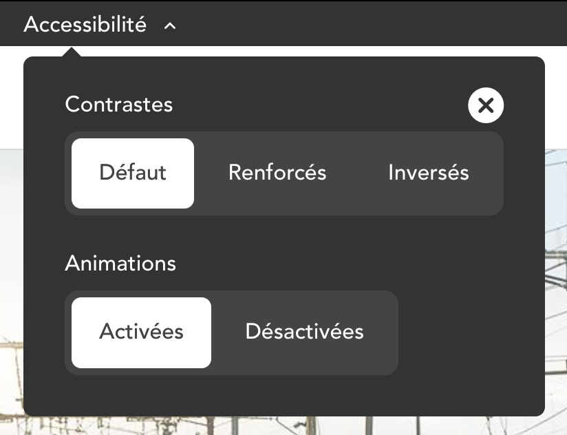
I would like to suggest a My main use case would be site designs that are expected to use a brand color which has bad contrast (when contrasted with a white background or white text). Switching the brand color with a more accessible one would be more acceptable to site owners if done for users who specifically requested it. Currently, websites with this use case either don’t address the issue, or offer in-site controls like on sncf.com:
Options in this example are:
|
|
@fvsch This issue is indeed about creating something like this, but I am not quite sure how your proposal answers the questions/concerns raised above it. The other |
|
agree with @frivoal here. i could see potential for a |
I’m not answering them and I know this is not an easy topic. :) I just felt this thread lacked input from authors about common design requirements and the client-side workarounds we use today (accessibility preferences that users have to find and enable on every site).
If a site switches to e.g. black text on white background on It might be an issue if authors use this preference hint to add |
|
Chiming in with a real-life use case from a recent design project. If the user has set increase contrast to “checked” in their host OS:
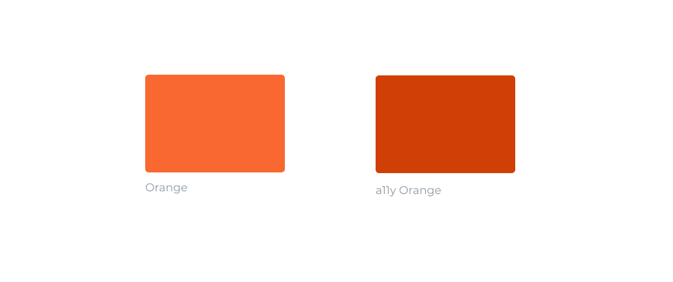
I would like to switch the orange in my designs to a11y orange in order to pass WCAG requirements.
It would change this:
To this:
As an author I would like to do it with the simplest code possible: |


|
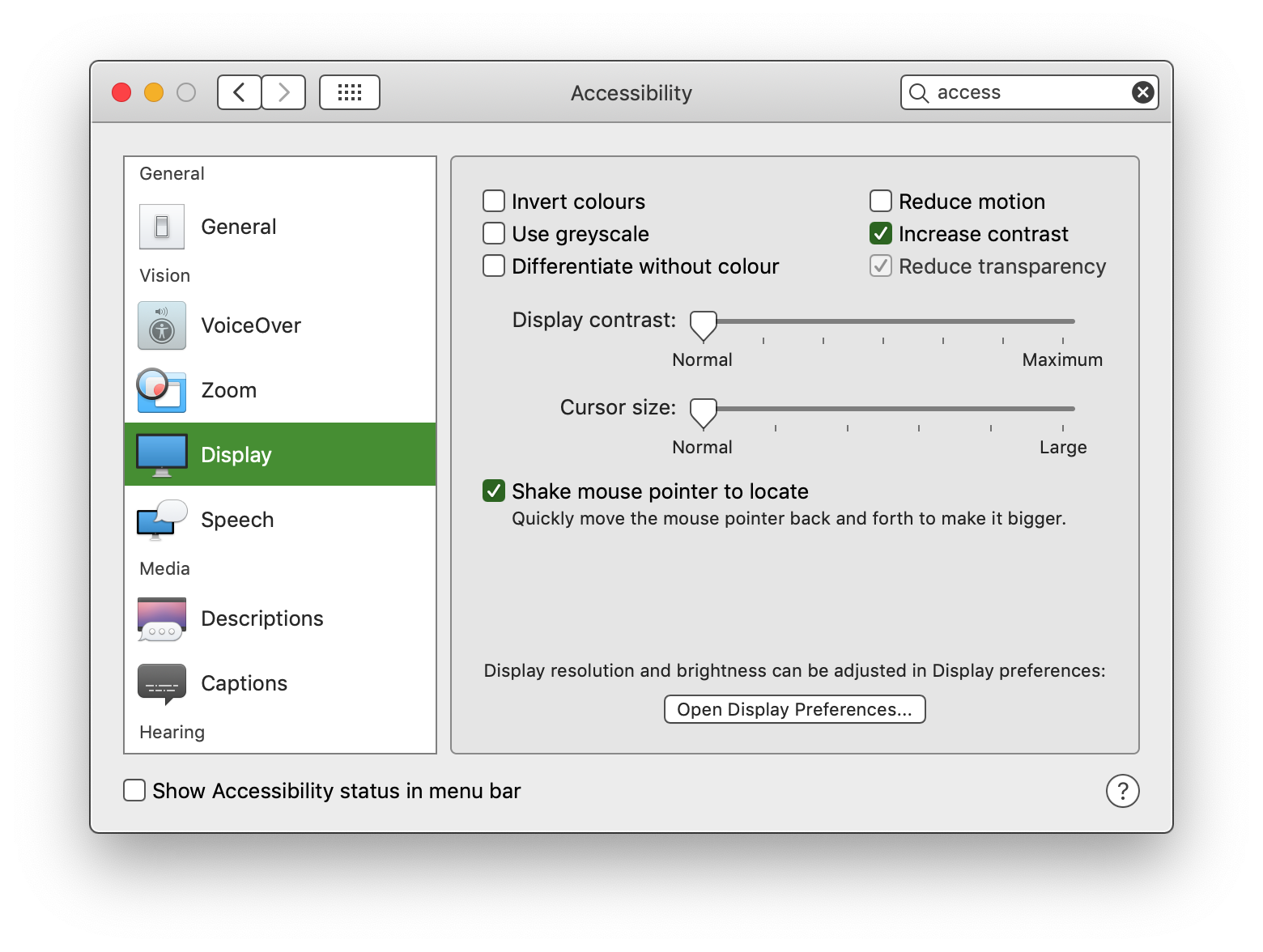
@Wolfr This actually seems like an anti-pattern to me. "High contrast" is distinct from WCAG AA compliant contrast, and is typically used by users with unusual vision conditions (often, but not always, conditions which qualify as "legally blind" where such a category exists). It will often look something like this: (Image from a blog post by The Paciello Group on In, uh, contrast, WCAG AA (and preferably AAA where possible) compliant contrast should always be enabled for all users. |

Yeah but the reality is that this rarely happens, the very Github comment button I am looking at does not pass WCAG AA.
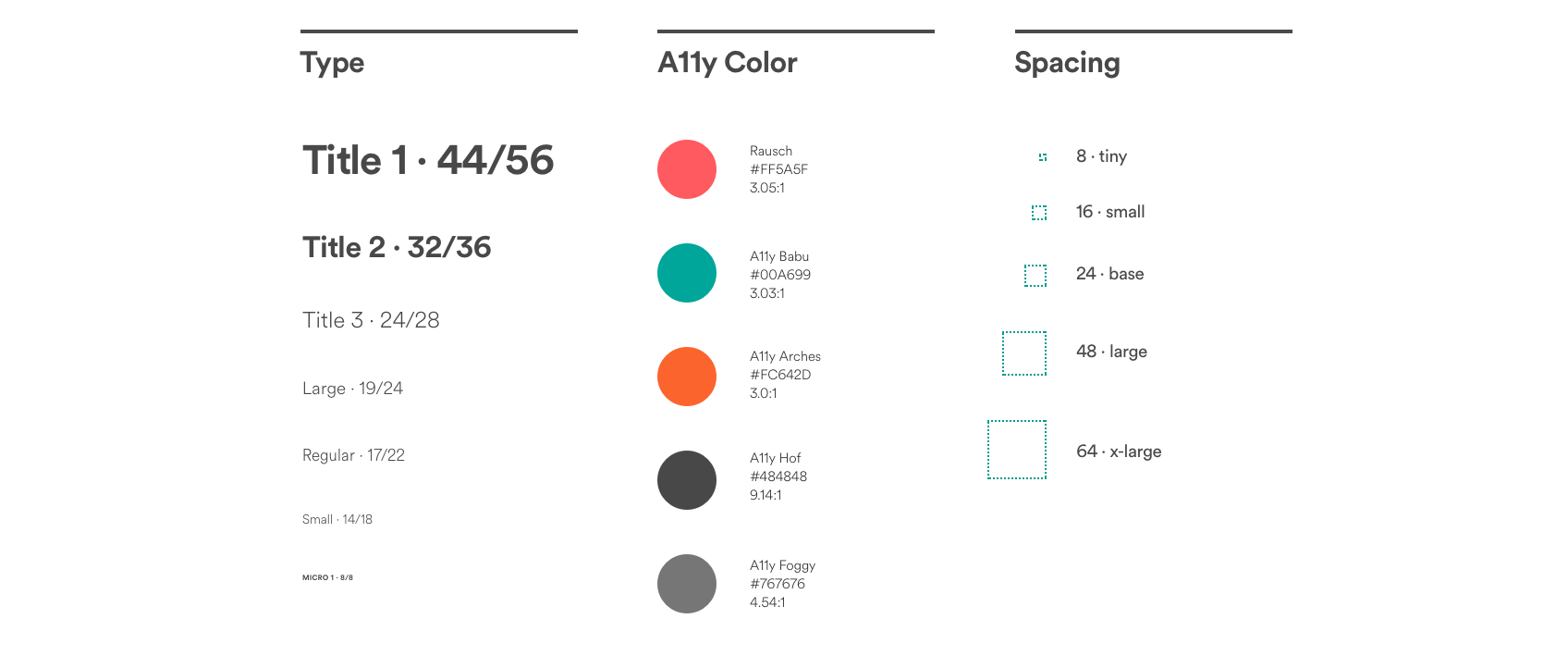
Designers are really looking at WCAG contrast ratio numbers together with the visual end result to try and make an interface that is both accessible and aesthetically pleasing. Here's an example from AirBnB where the colors are marked with “a11y”
My initial idea was that I wanted to be able to target users who have enabled a preference for high contrast. What I found is that the thinking around this is that the contrast level should be specified in the media query. My proposal is that it should be as simple as possible for the developer, otherwise they won't do it. Who has time to understand what 0.1 or 0.5 and 0.8 means in relationship to all the various factors at play? A singular switch seems like the most dev-friendly thing to do which in turn will lead to actual usage. @alice Looking at your comment, it seems my proposal for syntax is confusing because of the existence of MS's full-on high contrast mode. I wonder whether MS's full-on high contrast mode (almost like a Windows “theme” in my memory”) act s on every website as a sort of system override or does it only change the Windows UI and doesn't touch websites? I don't have a Windows device in hand to test. Your older comments [in this thread] indicate that you have a deep understanding of the problem space. As a web developer I was mostly looking for more attention to this issue when I posted my initial comments. The WCAG guidelines pose contrast fixes as one of the most important things one can do for a11y but in reality if you try to design with those AA/AAA passes in mind you will end up with something less than visually pleasing. There's also often (inaccessible) brand guidelines that make it impossible to get your design approved if you would change the colors to follow AA/AAA logic. So as a designer you are stuck: you want to do the right thing, but there is no way out. |

|
@patrickhlauke can you advise if this issue is still relevant so APA should track, or if it's addressed somehow somewhere? |
|
@patrickhlauke re-ping on question - is this issue is still relevant so APA should track, or if it's addressed somehow somewhere? |
|
@michael-n-cooper sorry, not spent any time here or at/with APA, so no idea...but seems that @cookiecrook pointed to #2943 and #443 (the latter of which then points to #1709) maybe a @w3c/csswg member can check/clarify if this thread is still needed / if the other locations should be tracked by APA instead |
|
Thanks for the pings @michael-n-cooper. I'm closing this issue because the original feature request has been fulfilled: a Any ongoing debates about the details should be brought up in separate issues (e.g. #2943 about whether there should be a distinction between Pinging @frivoal, who is listed as the assignee, in case this needs extra tagging for a future Disposition of Comments. |
Wondering if there's still potential for standardising a very simple implementation of a
high-contrastmedia feature, as an indicator that the user has enabled high contrast in their OS/UA.xref w3c/css-a11y#1
The text was updated successfully, but these errors were encountered: