Skip to content
New issue

Have a question about this project? Sign up for a free GitHub account to open an issue and contact its maintainers and the community.

By clicking “Sign up for GitHub”, you agree to our terms of service and privacy statement. We’ll occasionally send you account related emails.

Already on GitHub? Sign in to your account

Fix checkbox alignment issues in options and block manager modals (#16860) #16863

Merged
merged 9 commits into from
Aug 9, 2019
5 changes: 4 additions & 1 deletion assets/stylesheets/_z-index.scss
Original file line number Diff line number Diff line change
Expand Up @@ -112,7 +112,10 @@ $z-layers: (

// Make sure corner handles are above side handles for ResizableBox component
".components-resizable-box__side-handle": 1,
".components-resizable-box__corner-handle": 2
".components-resizable-box__corner-handle": 2,

// Make sure block manager sticky category titles appear above the options
".edit-post-manage-blocks-modal__category-title": 1
);

@function z-index( $key ) {
Expand Down
24 changes: 13 additions & 11 deletions packages/components/src/checkbox-control/index.js
Original file line number Diff line number Diff line change
Expand Up @@ -15,18 +15,20 @@ function CheckboxControl( { label, className, heading, checked, help, instanceId

return (
<BaseControl label={ heading } id={ id } help={ help } className={ className }>
<input
id={ id }
className="components-checkbox-control__input"
type="checkbox"
value="1"
onChange={ onChangeValue }
checked={ checked }
aria-describedby={ !! help ? id + '__help' : undefined }
{ ...props }
/>
<label className="components-checkbox-control__label" htmlFor={ id }>
<span className="components-checkbox-control__input-container">
<input
id={ id }
className="components-checkbox-control__input"
type="checkbox"
value="1"
onChange={ onChangeValue }
checked={ checked }
aria-describedby={ !! help ? id + '__help' : undefined }
{ ...props }
/>
{ checked ? <Dashicon icon="yes" className="components-checkbox-control__checked" role="presentation" /> : null }
</span>
<label className="components-checkbox-control__label" htmlFor={ id }>
{ label }
</label>
</BaseControl>
Expand Down
51 changes: 28 additions & 23 deletions packages/components/src/checkbox-control/style.scss
Original file line number Diff line number Diff line change
@@ -1,3 +1,6 @@
$input-size: 16px;
Copy link
Contributor

Choose a reason for hiding this comment

The reason will be displayed to describe this comment to others. Learn more.

Should these be declared somewhere more global (ie. _variables.scss)?

$input-size-sm: 25px;

.components-checkbox-control__input[type="checkbox"] {
border: 1px solid #b4b9be;
background: #fff;
Expand All @@ -6,14 +9,17 @@
cursor: pointer;
display: inline-block;
line-height: 0;
height: 16px;
margin: 0 4px 0 0;
outline: 0;
padding: 0 !important;
text-align: center;
vertical-align: middle;
width: 16px;
min-width: 16px;
vertical-align: top;
width: $input-size-sm;
height: $input-size-sm;
@include break-small() {
height: $input-size;
width: $input-size;
}
-webkit-appearance: none;
box-shadow: inset 0 1px 2px rgba(0, 0, 0, 0.1);
transition: 0.05s border-color ease-in-out;
Expand All @@ -39,34 +45,33 @@
}
}

.components-checkbox-control__label {
.components-checkbox-control__input-container {
position: relative;
display: inline-block;
margin-right: 12px;
vertical-align: middle;
line-height: 1;
width: $input-size-sm;
height: $input-size-sm;
@include break-small() {
width: $input-size;
height: $input-size;
}
}

svg.dashicon.components-checkbox-control__checked {
width: 21px;
height: 21px;
fill: #fff;
cursor: pointer;
position: absolute;
left: -31px;
bottom: -3px;
left: -4px;
top: -2px;
width: 31px;
height: 31px;
@include break-small() {
width: 21px;
height: 21px;
left: -3px;
}
user-select: none;
pointer-events: none;
}

@media screen and ( max-width: 728px ) {
.components-checkbox-control__input[type="checkbox"] {
width: 25px;
height: 25px;
}

svg.dashicon.components-checkbox-control__checked {
width: 31px;
height: 31px;
left: -41px;
bottom: -9px;
}
}
Original file line number Diff line number Diff line change
Expand Up @@ -54,6 +54,7 @@
top: 0;
padding: $panel-padding 0;
background-color: $white;
z-index: z-index(".edit-post-manage-blocks-modal__category-title");
Copy link
Contributor

Choose a reason for hiding this comment

The reason will be displayed to describe this comment to others. Learn more.

How is this change related?

Copy link
Contributor Author

Choose a reason for hiding this comment

The reason will be displayed to describe this comment to others. Learn more.

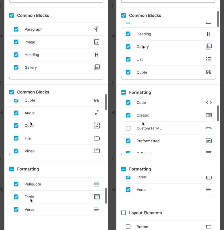
The headings for the block manager modal use position: sticky, creating a "sticky container" parent. Using a position: relative element (the wrapper for the input to position the checkbox) within the same sticky parent container, the browser treats them as in the same stacking context:

Screen Recording 2019-08-05 at 03 17 PM

Adding a z-index to the header makes the sticky header remain on top:

Screen Recording 2019-08-05 at 03 20 PM


.components-base-control__field {
margin-bottom: 0;
Expand Down Expand Up @@ -88,7 +89,7 @@
margin: 0;
}

.components-modal__content & input[type="checkbox"] {
.components-modal__content &.components-checkbox-control__input-container {
margin: 0 $grid-size;
}

Expand Down