-
Notifications
You must be signed in to change notification settings - Fork 4.3k
New issue
Have a question about this project? Sign up for a free GitHub account to open an issue and contact its maintainers and the community.
By clicking “Sign up for GitHub”, you agree to our terms of service and privacy statement. We’ll occasionally send you account related emails.
Already on GitHub? Sign in to your account
Fix: Button block does not centers on the editor #17063
Fix: Button block does not centers on the editor #17063
Conversation
| @@ -76,6 +80,8 @@ | |||
| } | |||
| } | |||
|
|
|||
| .wp-block-button-wrapper { | |||
| // Use display table for block previews. | |||
There was a problem hiding this comment.
Choose a reason for hiding this comment
The reason will be displayed to describe this comment to others. Learn more.
Conceptually, I don't think we should be having styles that target only previews.
The reason for the display: "table" is that the button container should only wrap the content and not takes the full width. I wonder if there's a way to keep the display table and fix the centering?
There was a problem hiding this comment.
Choose a reason for hiding this comment
The reason will be displayed to describe this comment to others. Learn more.
Hi @youknowriad, thank you for the context I submitted an alternative solution that keeps the display table and fixes the centering.
66a54d3 to
3557044
Compare
|
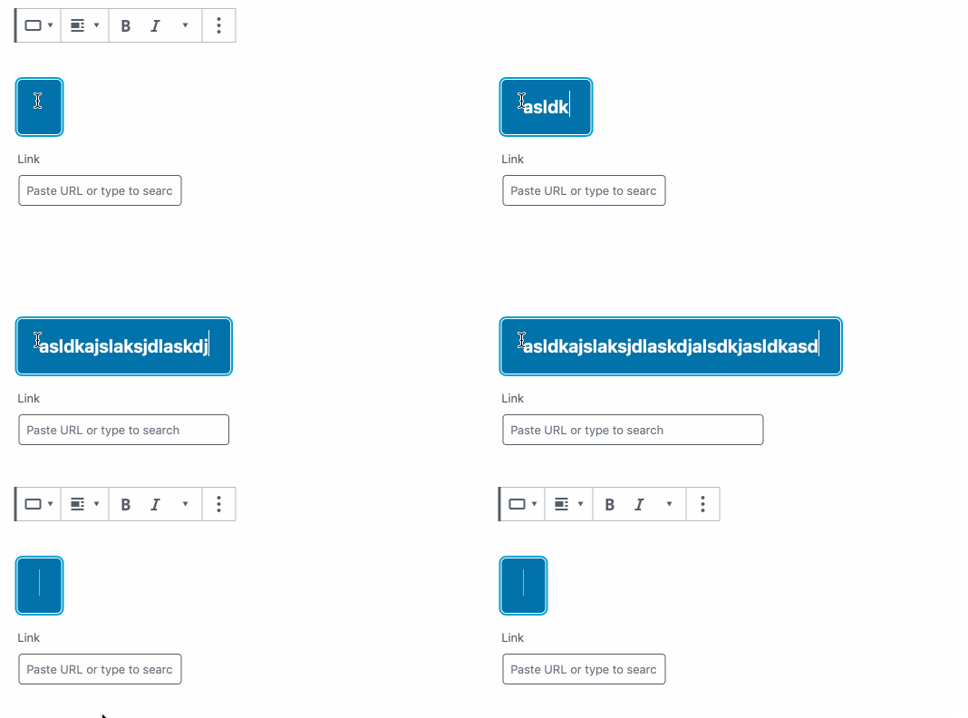
The preview is working properly right now but there's a small issue with the URL input, it's width adapts to the available width, which means if you have just a small button, the input is "cropped". |
Hi @youknowriad, I think this "cropped" behavior will always happen as long as we use the table display mode. The solution I see is not using table display when the block is selected I updated this PR to use this logic. |
|
@jorgefilipecosta why are we using |
I'm not deep inside the reason but I guess, max-width allows us to limit the width but if the button is nested in a small area we will be able to have a small input while if we used width the button would become big and may overflow the available space. |
If that's the reason, cropping the input for small buttons seems fine 🤷♂ |
Yes, I also think so. @jasmussen, @kjellr any thoughts on this? should we refactor these styles? |
|
Here's a screenshot for reference:
Yeah, I think we should refactor. That cropping isn't totally ideal. I've opened #17086 to keep track of this. |

Description
Fixes: #17059
Regressed in:#16873
In #16873 we started using a display table for the button block in the editor. As with this display mode, the previews look better. But this introduces a regression as in this mode align-center did not work as expected.
We also relied on withFallbackStyles to directly change the dom and add a class. We should avoid direct dom changes so this PR removes the class addition and uses a more complex CSS selector to avoid the need for that class.
This PR also only applies display table for the previews, as using a display table in normal block operation may be unexpected.
With these changes, the block itself got correctly center aligned but the link UI did not align as expected so a margin for the link UI was added.
How has this been tested?
I added a button block.
I tried all the alignment options in and verified the result was the expected one in the editor and in the styles preview.