-
Notifications
You must be signed in to change notification settings - Fork 4.3k
New issue
Have a question about this project? Sign up for a free GitHub account to open an issue and contact its maintainers and the community.
By clicking “Sign up for GitHub”, you agree to our terms of service and privacy statement. We’ll occasionally send you account related emails.
Already on GitHub? Sign in to your account
Merge the Button and IconButton into a single component #19193
Conversation
I think it's fine to keep
|
We do support buttons with an icon and a text at the same time, we shouldn't break this behavior.
The reason we have two props right now is because the aria-label and the tooltip text can be different. I agree that ideally one should be enought for both but we should check existing usage before making that change. It seems like you're saying we can't have "children" (text) and tooltip at the same time. Well! maybe we do? but I believe we need some design work if we want to support things llike "icon on the left + text", "icon on the right + text", "icon above text", "icon under text", regardless of whether these buttons are tooltips. These use-cases should be implemented separately once we have some clear design directions and use-cases. For the moment, I tried focusing on the existing components and their capabilities and how we can merge them together. |
To clarify, I'm not saying we should stop doing that if it exists, but we should make it clear that
I missed that, it's probably not ideal. I remember reading about patterns related to that in https://inclusive-components.design/tooltips-toggletips/. I don't know anymore what is the best way of moving forward 😅 It needs some further investigation of what would be the best way to handle it. Reakit uses |
|
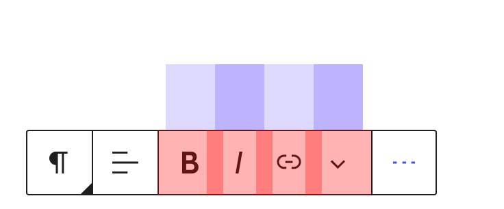
Took this PR for a spin, and things look unchanged in the editor. That's good! Also, From a visual/design point of view, this unification does make sense. On a higher level, and speaking not of changes in this branch but of changes to come in the future, I would caution being too principled with the properties, as things like paddings will diverge depending on whether a button has an icon or not, and indeed a number of other aspects. For example, icon only buttons should be square: ... unless multiple icon only buttons are shown in a row, in which case their dimensions need to be optically balanced. Here, the red shows 48x48px rectangles and how they overlap to be optically balanced. The blue shows that buttons other than the first and last in a sequence actually need to be 36x48: Buttons themselves also need a wider horizontal padding in order to look harmonious, but more importantly, to distance themselves from input fields: And lastly, icon plus text buttons will likely need horizontal padding that is different on the left vs. on the right, so as to balance the icon correctly: None of that should be impossible to do. But it is something we should be aware of. |
|
Notably, despite #7534 seemingly being a contradictory proposal, there were similar conclusions reached (#7534 (comment)). |
| @@ -44,19 +58,56 @@ export function Button( props, ref ) { | |||
| 'is-busy': isBusy, | |||
| 'is-link': isLink, | |||
| 'is-destructive': isDestructive, | |||
| 'has-text': !! icon && !! children, | |||
| // Ideally should be has-icon but this is named this way for BC | |||
There was a problem hiding this comment.
Choose a reason for hiding this comment
The reason will be displayed to describe this comment to others. Learn more.
There was a problem hiding this comment.
Choose a reason for hiding this comment
The reason will be displayed to describe this comment to others. Learn more.
Yes, we can do it, just trying to keep the changes small for now. Ideally, we also deprecate the component.
There was a problem hiding this comment.
Choose a reason for hiding this comment
The reason will be displayed to describe this comment to others. Learn more.
I looked at this and there are a few components that rely on this for styling. I'm going to leave it for a follow-up PR to ensure we test these properly and ease review of the current PR.
|
I noticed that the "tooltip" prop is only used to force showing a tooltip or to disable it and not necessarily to change the tooltip text in our code base. |
Co-Authored-By: Grzegorz (Greg) Ziółkowski <[email protected]>
2ca5ed5 to
d8dac0b
Compare
|
any thoughts on landing this? I have two follow-ups planned:
|
| // the children are empty and... | ||
| ( ! children || ( isArray( children ) && ! children.length ) ) && | ||
| // the tooltip is not explicitly disabled. | ||
| false !== showTooltip |
There was a problem hiding this comment.
Choose a reason for hiding this comment
The reason will be displayed to describe this comment to others. Learn more.
this condition is now very similar to
( showTooltip && label )
we can refactor it later as it's quite hard to read :)
There was a problem hiding this comment.
Choose a reason for hiding this comment
The reason will be displayed to describe this comment to others. Learn more.
There's a difference between explicit disabling of tooltips and "undefined"
There was a problem hiding this comment.
Choose a reason for hiding this comment
The reason will be displayed to describe this comment to others. Learn more.
I figured it out after 2 additional minutes spend on contemplating on it 🤣
There was a problem hiding this comment.
Choose a reason for hiding this comment
The reason will be displayed to describe this comment to others. Learn more.
Let's move forward, I love the direction where it is heading. It's easier to review when we do it in smaller steps 👍
|
Removing the needs dev note label because I think the dev note for #19299 will also handle this change. |
|
@youknowriad Are there any plans to include this in WP core yet? I mistakenly thought that it was already as I'm using it my plugins but noticed it broke when I deactivated the GB plugin. |
|
My bad, had wrong version installed. I see it now. Looks great! |


See the
Button&IconButtonaudit #16541 and the following part in particular:In this PR, I'm trying the second approach here and unify the Button and IconButton. Code-wise, it doesn't seem complex. The questions if we follow that route are:
Thoughts @mtias @davewhitley @gziolo @aduth @jasmussen @ItsJonQ @diegohaz