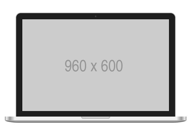
React component for CSS Devices in your project. (NOTE: This project is still work in progress. Marvel Devices are however ready to use. More devices and customization coming soon.)
npm install --save react-css-devices
Important Note : You need to have a css-loader installed. for example with webpack
| Props | Cool | Prop Values |
|---|---|---|
deviceName (String) |
Name of the device | iphone6, iphone6plus, iphone5s, iphone5c, ipad, iphone4s, nexus5, s5, htc-one, macbook |
color (String) |
Color ( only supported by iphone5c for now ) |
white, black, red, yellow, green, blue |
orientation (String) |
Landscape or portrait | landscape, portrait |
transform (Integer) |
Scale the device to your size ( Size chart below ) | default is 1 |
| Device | 1x Portrait Size ( Device ) | 1x Portrait Size ( Screen ) |
|---|---|---|
iphone6 |
423x887 | 375x667 |
iphone6plus |
466x960 | 414x736 |
iphone5s |
364x778 | 320x568 |
iphone5c |
364x778 | 320x568 |
ipad |
626x948 | 576x768 |
iphone4s |
374x738 | 320x480 |
nexus5 |
350x668 | 320x568 |
s5 |
356x688 | 320x568 |
htc-one |
370x740 | 320x568 |
macbook |
1048x720 | 960x600 |
To create a black iphone in landscape you do
import { MarvelDevices } from 'react-css-devices'

<MarvelDevices deviceName={"iphone6"}
               color={"black"}
               orientation={"landscape"}
               transform={0.5}>

    {/*Paste your content here*/}
    <img src={"http://via.placeholder.com/667x375"}/>

</MarvelDevices>
Any suggestions / improvements / critics are welcome. I'm available on @aswinckr
