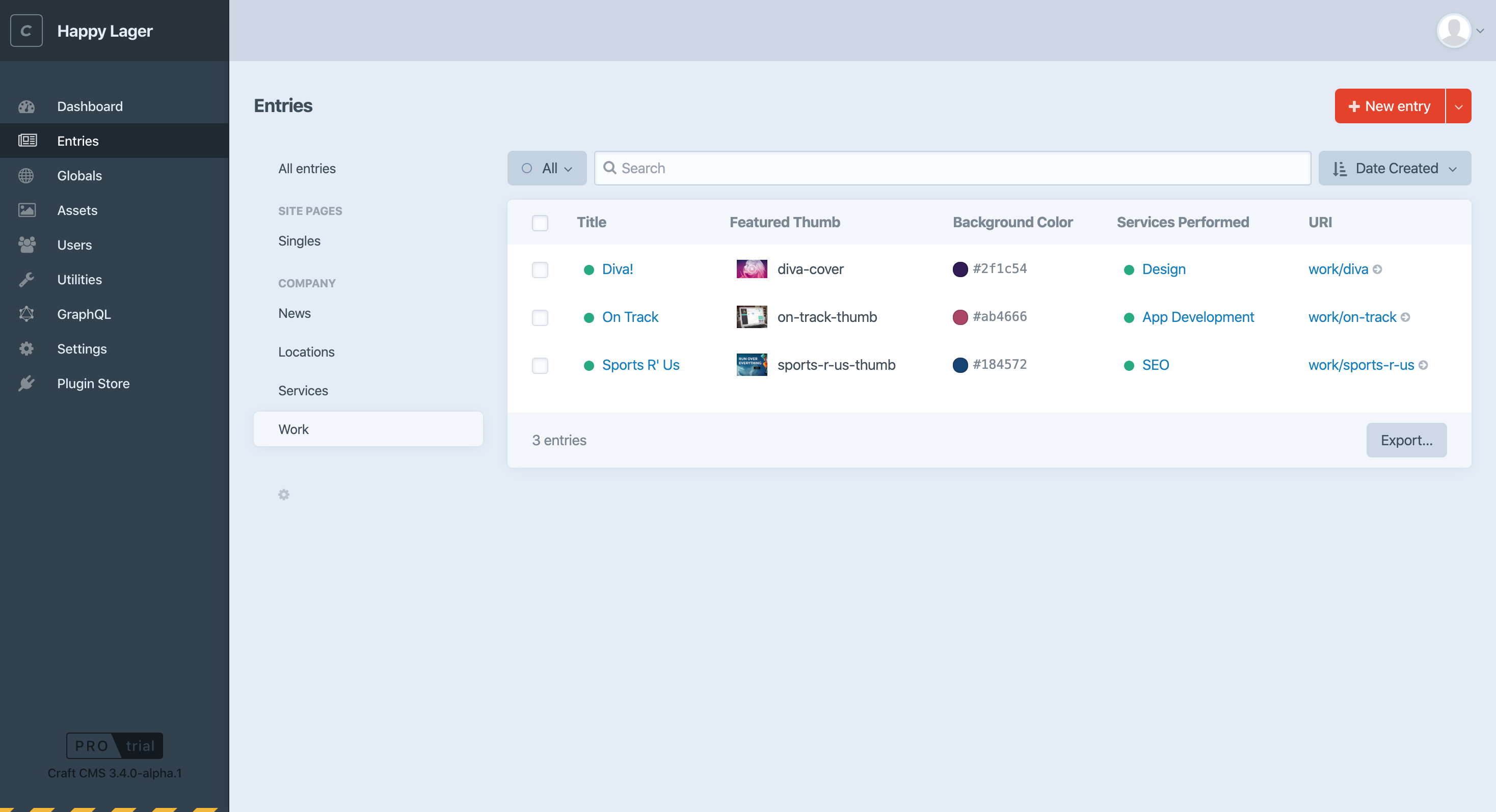
Wishlist and suggestions for the Craft 3 control panel #2883
Comments
|
A noticeable improvement I think. I added this rule to give the details sidebar a light background grey, which I think helps keep it separate from the main content editing area: |
|
I love this suggestion...
And these are nice too...
|
|
Styling is very subjective (believe thats the right term) but I prefer the cleaner look as shown in the example above over the current look in the admin panel in Craft 3 |
|
@croxton Maybe some contrast would not hurt. If a light one would be enough, in the left sidebar in /admin/entries there is one that could be used to unify things (s. below). Thanks everybody for taking the time and look at this, and thank you P&T team for considering what´s in line with your plans!
|

|
The details pane already got a lighter color in Craft 3.0.8, and Redactor fields now use the CP’s font stack as of version 2.1.0 of the Redactor plugin. |
|
I would love to see more contrast in the control panel, to meet WCAG 2.0 contrast requirements. Maybe a high-contrast theme option, if you don't want to change the default. 🙂 |
|
@brandonkelly Would you be interested in a PR for a AA-compliant CP theme? Maybe @lindseydiloreto could help too. |
|
Sure! |
|
Sounds great! But don't bank on a contribution from me, unfortunately... I'm very much a programmer, with little to no design skills. I also know nothing about AA compliance. Perhaps @carlcs or @marflow want to lend their expertise? To be honest, it sounds like you could just release "AA Compliance" as a theme-only plugin. That way, folks who care about compliance can just download the plugin and get their theme adjusted automatically. |
|
We do want Craft to be as AA-compliant as possible out of the box, so the PR would be welcome. If aspects of it seem like they’d be undesired, we could consider adding a user preference(s) to toggle it. |
- Text inputs: 2px border radius, blue hover border
- Global sidebar: dark hover BGs, lightened edition logo
- Global header: increased height, increased crumb font size, darkened BG
- Tabs: no more hairlines in between each tab
- Details pane: same BG as background, increased top padding

Inspired by some suggestions in #2883
|
👀 Update: The input styles have changed. See #2883 (comment) for updated screenshots. Excited to say that this is now resolved for the upcoming 3.4 release, which will introduce lots of visual refinements across the whole Control Panel.
To help test, change your "require": {
"craftcms/cms": "3.4.x-dev",
"...": "..."
}Then run Plugin devs: If your plugin has any custom styling, you will probably need to adjust some things to make it feel right. (We have some work to do on Redactor, as you can tell from the screenshot:) I’ve just pushed |


|
This looks great, @brandonkelly! Really like the tab ellipses addition. One request: Some of the input fields look like they’re in a “disabled” state. The search input and Title field, for instance, appear like they may not allow input. I think those ought to remain white but that’s just my two cents. Changes are looking great though! 😊 |
|
The details page design is a nice improvement, minus some UX issues like @aaronbushnell says (fields look disabled) But not the biggest fan of the area between the main nav left and the white panel in the new list page design. Looks a bit "unfinished" to me. I do understand the need to make it look a bit less "technical" but that area could use some extra love in my opinion. (my 2 cents, as design can be highly personal of course) |
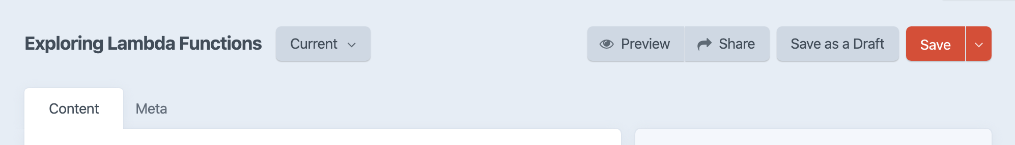
FWIW, I'm a fan for totally moving the title field to avoid the awkward behavior that currently exists with the title remaining as you change tabs:
|
|
Overall this is a great improvement over the previous iteration. The end result feels cleaner and easier to navigate visually! If I may humbly add a couple of comments:
|
|
Really happy with the re-design! Overall it looks less technical, more light-weight and friendly. Also, I would like to add another +1 to the comment form @aaronbushnell on the background color of the fields. They seem disabled already on the login screen. Also, the background from text fields of revisions are turning from white to blue, which means disabled in that context. |
I agree with this being problematic, but also wonder if it could be solved by bringing back the thin shadows that visually lift those elements. (Just like the Redactor buttons in the second screenshot.) |
There are some very subtle inner shadows in the text fields already, and I wonder whether darkening them will help.
(Keep in mind too that both the Search input and Title input are focussed when these pages are initially loaded, so the focused state + blinking text cursor should also help avoid the impression that the fields are disabled.) The darker shadow change has been pushed up (c6eefc4). Follow the instructions in my previous comment to update to Craft 3.4, and if you already did, just run (BTW these screenshots can be a little deceiving so please hold your judgement until you’ve updated ;)
@baronetto Yeah… I did play with removing the padding but couldn’t get it to look right, especially since there’s also the thumb view to consider when viewing users and assets. And the BG color in the table header makes more sense when the results are being sorted by one of the columns. I felt the sorted heading looks a lot better when the other headings have a slight background to them.
|


|
I commented too quickly and meant to respond to the flattened menus and buttons. The "sunken" text inputs (with darkened focus) seem clear; I'm wondering if menus/buttons (Current, Preview, Share) are immediately identifiable as interactive elements compared to the visually-similar entry timestamp panel. A thin sliver of shadow used to more clearly distinguish between the two, and it seems like they're nearly identical except for a hover state. |
|
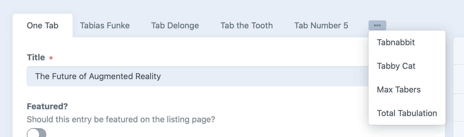
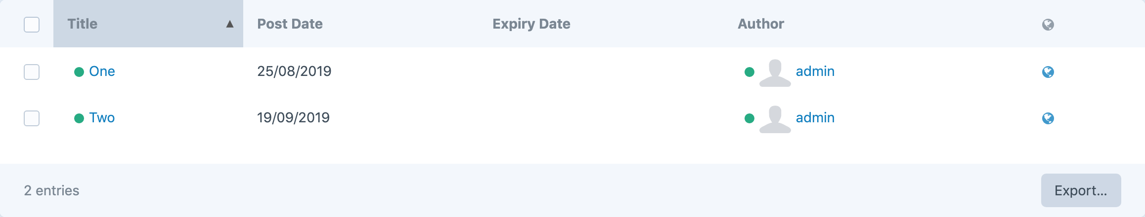
I miss the dotted bottom borders on the element/entry index listings. This was a big help, particularly when viewing on high resolution screens where you had lots of listing columns. But rather than add borders back, perhaps tiger striping might be a more suitable technique to fit with the new style? |
|
Really fond of these updates 👏! Especially the entry edit page returning to a more pre-Craft 3 feel.
Based on that, maybe something like the below would work? Comparison screenshot: |


|
First of all: Great job! Some feedback:
A thought:
Edit: will take this for a spin tonight to try and adjust some of these points. |
|
I really like that the meta content panels on the right are toned down and therfore the main content fields stand out much more. Great job! |

|
Overall, loving the changes. My only reservation would be the text input field background grey looks a little dark, and for consistency the same background colour and border radius should also be used for the WYSIWYG editor field. How about this?
|

|
Installed it locally
|
|
@alexjcollins I was thinking similarly to your first mockup, but only using that thin sliver of shadow without changes to the button color or stroke. That way the visual balance of each layout could be maintained but there'd be some indication (without hover) that the element is interactive.
|
|
Tried something with a little lighter tone and a little less blue: |
|
Here’s where I ended up with the input styles:
What’s changed:
@alexjcollins Yeah I toyed with both options, but decided I like the look of the toolbar separated from the main content area better, as it is more of a heading for the content. |


|
@brandonkelly , would you consider using tiger striping (i.e. alternate row background colours) on the items in the element index listing? Perhaps rotating between white and a very light grey or something like that. |
|
@timeverts Shouldn’t be necessary; the rows get a light background color as you hover over them. |
|
@brandonkelly looks awesome, can't wait |
|
From a designer's perspective, this UI feels way more focused. My eye is led to all the right places so I believe this is a major improvement. I do like the contrast values, however, I have to say the blue tone does make the UI feel cold and slightly uninviting. I think converting this theme to gray values would be the safest bet. Overall, excellent work! |
|
Nice work, @brandonkelly! How are the contrast ratios compared to WCAG 2.1 AA? I know I offered a high-contrast PR long ago, when I was young and innocent, and then never delivered... 😬 |
|
@KatieMFritz Contrast ratios are about the same as before. We are planning a High Contrast Mode for Craft 4 though ;) Follow #3293 for updates on that. |
|
@brandonkelly Thank you for the reply! I just wanted to post a screenshot regarding my comments about the container. It would also allow the header to stay pinned at the top and allow the checkbox to stay aligned with the rest.
|

|
@baronetto How do you envision that to look when viewing users or assets in thumbnail view? |
|
@brandonkelly In thumbnail view the table header would have to hide, leaving only the checkbox that allows the user to select all items. In the table view I posted, the position of that checkbox inside the table header would be enough to imply its functionality but in the thumbnail view there would be a need for a text label. I'm posting a couple of screenshots for the suggested layout:
|

|
@brandonkelly In the first layout, the header could also be used for additional view options such as changing the size of the thumbnail, toggling additional metadata (image size, volume type, user group etc.) |
|
@baronetto Good call. Just made those changes (83d27a3). Other table panes in the CP have been updated as well.
|


|
@brandonkelly You probably already know this, but the element index header is no longer sticky, meaning that it disappears out of view when you scroll down the list of elements. Otherwise I'm loving the UI improvements!! |
|
Yeah I’m aware, but it didn’t really feel necessary anymore since there’s not as much scrolling these days thanks to pagination. |
|
@brandonkelly Wow! I'm so glad these changes made it to the next version 🎉 +1 for the sticky header :) It's true pagination makes less it necessary but it can be often useful in case the columns display similar values and the same space could be used as a toolbar in thumbnail views. |
|
Alright… I just moved the page toolbar into the page header, which both looks better and brings back the fixed toolbar.
|


|
I think the padding around the select all checkbox looks a little unbalanced when in its hover state or when the proceeding column is highlighted. Either The spacing between the table rows and footer also could be reduced from 24px to 1px to tighten things up.
|

|
just some kudos -- the result is looking noticeably nicer, on my non-ips ok-but-not-better laptop screen. |
|
@rynpsc Appreciate the feedback but both of those were intentional. @narration-sd Glad you’re liking it! |
|
Hey all, I really appreciate all the work you are doing with Craft CMS. Please interpret the following as from someone who cares about the product: I think that this latest update has too much blue in the UI, and the flat look is a step-back from the Craft 2 look. It feels more like a toy, or a product aimed at really new users, and not a well designed tool. The Craft2 UI style was quite spot on. The buttons looked like buttons. Visually sections were group or separated in an intuitive manner. But I feel we have lost a bit of simplicity with the latest updates. Github is a good example of simple UI that is powerful but not overwhelming. The use of grey, shaded buttons and controls, and white space is really good. |
@jkesler-va I don't think that's a very valid claim and not helpful for design-criticism. It's more important to focus on concrete verdicts.
There are plugins which you can change the color palette easily by the way: https://plugins.craftcms.com/cp-css |
|
@jkesler-va Appreciate the feedback; it brings up a valid point, that design is subjective, so maybe there should be more built-in flexibility on it. We will be looking into that in Craft 4, along with accessibility improvements like dark mode & high contrast mode. |
 and others
So somebody is nagging about the Craft CP again …
Comparing Craft 2 and 3 CPs – I think we have lost quite a bit of friendliness and „softer“ design details. Craft 3 makes better use of available space, but with the narrow head area, the main content area framed by the dark blue main nav and a still dark right details sidebar, it looks more technical and a less welcoming (at least to me).
Here´s a short list of suggestions. I´ve put this together using the great Control Panel CSS plugin (thank you for making this @lindseydiloreto!).
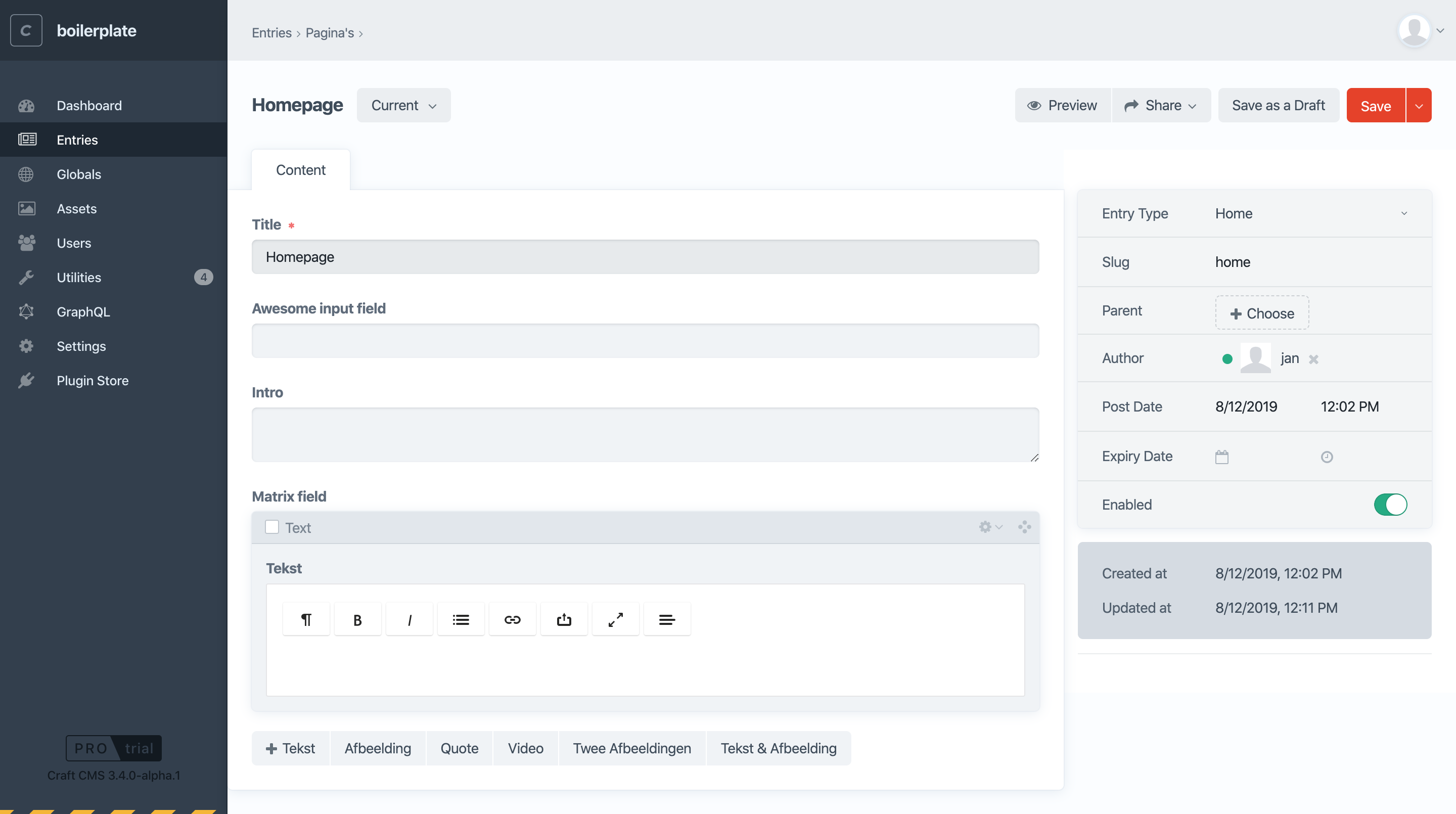
Head area / Details sidebar
The head area would benefit from some extra vertical space I think. Also, there are many different baselines for Site name, user, breadcrumbs, and entry title. Maybe that could be cleaned up so that Site name and user on the left and breadcrumbs and entry title on the right share the same top line and baseline respectively. (Or the user could be moved to the bottom like in Craft 2, which would also make it less busy at the top.)
Also, I am missing the red title and wonder if we can get it back? It´s a small splash of color but makes the header or titles stand out and the CP less monochromatic but richer and more pleasant.
This is my major issue: I am at odds with the position of the revision button right after the title, and the centered Live Preview and Share buttons. All three are jumping around from title to title. I think it would be much cleaner and spacious if Preview and Share sat next to the Save button on the right. As for the Revision button – would that not belong somewhere inside the right details bar next to the various entry dates? I would definitly prefer it there. Also it should not show up at all, if I don´t make revisions available to clients.
Lastly, I find the layout even calmer, if the head area and details sidebar are white for the most part. With the current blue, the sidebar looks like a „read-only“ area on total, when in fact clients are supposed to make edits. The vertical line would be enough separation for me.
Main container
If using the white background, changing the font weight to bold adds attention to active tab.
For input, text area and redactor fields, adopting the 2px border radius from the buttons would make the design a little softer. Also the focus for input and text area is a black outline, for Redactor it is blue. Maybe a blue focus border for all fields would be friendly. (Blue is already the hover color for the tabs.)
Redactor also should use the system typeface to make it look like the original Craft fields.
The matrix button group for adding matrix blocks has a high top margin so it sits too far way from the matrix field label. Setting the margin to 0 looks right and in accordance with the (first) added matrix block.
Finally, to me the asset field type when set to large thumbnails is not ideal. The distance from the image to the label and its file name and the left and right border changes depending on the image orientation, since the thumbnails is loaded in a square 100px box. With only one image loaded, this looks a bit off. Maybe a light grey border would „explain“ what´s going on, or the thumb and asset name could move up for landscape, and assets left for portrait images?
Another question regardiing this field: If the thumbnails are large, the file names are shortened because of the 100px „wide" col. Does the file name then make sense at all, or should it dropped completely and be replaced by two buttons („x" Delete and „i“ Info?). The info could open the image element editor with file name, etc.
Final peanut
The Craft version in black does looks a bit harsh to me. A lighter or darker blue would melt it in more.
What do people think – if this is just me I´ll shut up ;)
And If somebody wants to try the suggestions it easy to do with the free Control Panel CSS plugin and the attached css file. (If you would like to see it with the original light blue header and tabs area you can comment out the white background for „body“ and "#main-container #main #header“.)
craft-cp-modifications.css.zip
The text was updated successfully, but these errors were encountered: