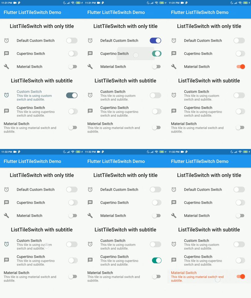
ListTileSwitch is a simple widget that combines ListTile with a switch. Offering 3 types of switch widgets:
- Switch: Material Switch from Material library on Flutter SDK.
- CupertinoSwitch: CupertinoSwitch from Cupertino library on Flutter SDK.
- A custom switch.
Tested on Android and Web but not iOS. Theoritacially it should work on iOS devices too, since this package contains nothing but pure Dart and Flutter components.
Add dependency for package on your pubspec.yaml:
dependencies:
    list_tile_switch: <latest>
Use it as a regular ListTile widget with a bonus: the trailing widget is a switch. Covering all aspects of the ListTile and adding more with a custom switch.
| Parameter | Definition |
|---|---|
double switchScale |
Adjusting the scale of the switch widget. |
Color switchActiveColor |
The color of the switch when the switch is active. |
bool toggleSelectedOnValueChange |
Deciding whether to color the ListTile when switch value is true, the selected color will be the switchActiveColor. |
Color switchInactiveColor |
Color when the switch is inactive. |
SwitchType switchType |
Indicating the type of switch to be displayed. |
bool value |
Current state of the switch value. |
onChanged(bool) |
Toggle callback for the widget. |
Widget leading, Widget title, Widget subtitle, Widget isThreeLine, EdgeInsetsGeometry contentPadding, VoidCallback onLongPress, VisualDensity visualDesnsity, bool dense, bool enabled, FocusNode focusNode, bool autoFocus, bool selected, Color focusColor, Color hoverColor, MouseCursor mouseCursor |
Referring to the original implementation of ListTile from Flutter SDK, all of the values are mapped directly to the ListTile widget internally. |
import 'package:flutter/material.dart';
import 'package:list_tile_switch/list_tile_switch.dart';

void main() {
  runApp(MyApp());
}

class MyApp extends StatelessWidget {
  @override
  Widget build(BuildContext context) {
  return MaterialApp(
  title: 'Flutter ListTileSwitch Demo',
  debugShowCheckedModeBanner: false,
  theme: ThemeData(
  primarySwatch: Colors.blue,
  visualDensity: VisualDensity.adaptivePlatformDensity,
 ),  home: ListTileSwitchExample(title: 'Flutter ListTileSwitch Demo'),
 ); }}

class ListTileSwitchExample extends StatefulWidget {
  ListTileSwitchExample({Key key, this.title}) : super(key: key);
  final String title;
  @override
  _ListTileSwitchExampleState createState() => _ListTileSwitchExampleState();
}

class _ListTileSwitchExampleState extends State<ListTileSwitchExample> {
  bool _value = false;
  @override
  Widget build(BuildContext context) {
    return Scaffold(
	  appBar: AppBar(
		title: Text(widget.title),
	  ),
	  body: ListTileSwitch(
	    value: _value,
		leading: Icon(Icons.access_alarms),
		onChanged: (value) {
		  setState(() {
			_value = value;
		  });
		},
		visualDensity: VisualDensity.comfortable,
		switchType: SwitchType.cupertino,
		switchActiveColor: Colors.indigo,
		title: Text('Default Custom Switch'),
	 ),
   );
}}
The list of additional features that are considered to be implemented in the future.
- Creating more tests
- Add interactivity to custom switch widget
- Make custom switch more configurable
- Configurable thumb shape
- Configurable track shape
- Scaling animation on value change
Contributions are accepted via pull requests. For more information about how to contribute to this package, please check the contribution guide.
This project is licensed under the MIT license, additional knowledge about the license can be found here.
