Iced branding #143
Comments
|
This is amazing, @AlisCode! I believe there is a lot of work in the library that will need exploration like this and you are setting a really good precedent. Thank you very much! ❤️ As you probably realized, I named the library Iced because it started as a part of The drafts look like a nice starting point! As you said, some gradients (and maybe some shiny spots and rounded corners?) would probably make the ice more recognizable. Adding some context is also an interesting approach, like the drink one. It definitely helps to identify the ice. For the text, I think we should just capitalize the first letter: Iced. The name is short and using all upper-case may make it seem like it's some kind of acronym (e.g. Internal Compiler Error). I also think we should strive for simplicity (just like the library!) and I believe this is a really great start! |
|
Hi, I want to share my modest contribution, definitely not a final version, but if I can help for the final design ;-)
|

|
@othelarian Thanks! I feel there are too many elements here. We should try to keep it simple. I think the logo should be a single "element" with a simple shape and one or two flat colors at most. As I mentioned, blue and brown seem to be hard to mix. I do not think of ice when I look at these squares, maybe we could play with isometric cubes? I believe the idea of the logo being part of the "i" dot may be interesting. |
|
I'm under the same impression. The big problem with "amateur" logos is that they tend to show too many ideas at the same time, resulting in a confusing / meaningless logo. Just take Flutter for example : 3 bars vaguely resembling the shape of an "F", as in "Flutter". One drop shadow. One modern font, no serif. It's as simple as that. You just "know" it's about something like UI, and it's modern. Great logo IMHO. I also don't particularly like the option of making the logo "take part" in the font itself: I just feel like it usually doesn't work. I'm working on a second iteration so that we can start looking at other ideas. |
|
My idea would be that the logo could be something like this with text below it?
The ice cubes are stacked on top of each other forming a kind of layout. However, the possibility of the ice melting could suggest it's not a very durable formation 😅 Just a suggestion. Something like this above with whiskey on the rocks: The brown-ish whiskey could resemble the Rust part of Iced? If whiskey is not your thing: Illustrator file if anyone wants to play around: |


|
So I just had this idea which I think could look like something cool given a bit more work.
Granted we have to change the font, colors and proportions (this was drafted in 2 minutes with Inkscape) :) |

|
@JakubKoralewski whiskey?! this isn't |
|
@JakubKoralewski Awesome! I like the font, like the colors, but I don't get the "it's a UI framework" vibe from it. There's definitely something that can be done with that layout though :) Edit: Do you think it would be possible to design these 3 ice cubes as I showed and combine them like you did ? We could also maybe apply a gradient on the outline to make it look 3d-ish ? |
|
@artursapek but if my English does not lead me astray on the rocks means iced @AlisCode you mean like a little pyramid out of these kind of cubes? It would also be interesting to try to recreate the Elm logo using ice cubes somehow maybe |

|
@JakubKoralewski that's exactly what I meant ! I'm not sure how good that would look, though. You seem to be quite Illustrator-savvy, maybe you can try that as an experiment ? I like the idea of representing an ice cube, and the nodes at the coners are great in my opinion : They represent modularity and "communication" logic which are core Iced principles. I lke your font, and the idea of having the logo on top of the text. I will try to use it :) |
|
@AlisCode The gaps you're leaving out on some lines next to the dots have some sort of rule where they appear or is it your creative decision? If it looks like I'm savvy in logo making then sorry for misleading you 😅 I took the liberty to add some colors and stuff don't know if you like that. Another idea is to change the crates in the crates logo to ice cubes? I edited the colors a bit to make the cardboard boxes(?) look more like ice
I guess the tape doesn't make sense and it's a very low effort rip-off. But just another idea. |


|
@JakubKoralewski the gaps were purely my creative decision - if you could call that creative, lol. Btw, I re-did my cube thing with better proportions, applied some gradient to it (random colors, still needs work :) ), Montserrat Alternates font. I think it looks better with gaps but just to give an overview of what I think a cool logo would look like :
(sorry for the mouse in the screenshot) Thoughts ? |

|
@AlisCode That looks great imo. I like the left one more, but I feel like the name should pop more, maybe a bolder weight? EDIT: Or could you make one version where the text doesn't have a gradient? The brighter side on the left kind of blends with the white background |
|
@JakubKoralewski I'm not Inkscape-capable this weekend but will make sure to try that sunday evening and afterwards. I think defining 3-4 colors as "main palette" and 3-4 colors as "accent palette" would be a good "next step" :) |
|
Added the gaps and removed gradient on text - tested with 3 different font weight (normal - medium - semi-bold)
I think the middle one with decent colors could be pretty good ! Thougts ? |

|
Nice! Very excited with the progress! I think we are onto something here. Some thoughts:
The isometric cube seems like an interesting idea, though! Maybe we could try different angles? |
|
This is with fill-mode instead of stroke-mode :
After reducing the "handles" and adding shinyness, I get something like this which doesn't feel quite right ...
I think a schematic isometric ice cube is impossible to do correctly, we're trying to illustrate rather than suggest. If we want this to "feel like ice", we probably want something that suggests a shape directly related to ice ; a cube is too generic. Here is what @hecrj and I discussed:
Anyone willing to give this a shot ? |


|
I got it guys.
|

|
Let's pack it up boys. I think we found it. Unless...
|

|
I wonder if we can bring some "impossible shapes" into logo. It means " impossible is possible" :) |

|
@piaoger I dig that |
|
I absolutely love this one, I've got some graphic designing background
under my belt. I'd like to help out if possible.
…On Tue, 14 Jan 2020, 02:58 Olivier Pinon, ***@***.***> wrote:
This is with fill-mode instead of stroke-mode :
[image: image]
<https://user-images.githubusercontent.com/12024408/72295278-8a62b200-3657-11ea-8879-dfde7146294f.png>
After reducing the "handles" and adding shinyness, I get something like
this which doesn't feel quite right ...
[image: image]
<https://user-images.githubusercontent.com/12024408/72295152-3f489f00-3657-11ea-8217-eff20338a6d3.png>
I think a schematic isometric ice cube is impossible to do correctly,
we're trying to illustrate rather than suggest. If we want this to "feel
like ice", we probably want something that suggests a shape directly
related to ice ; a cube is too generic. Here is what @hecrj
<https://github.com/hecrj> and I discussed:
So, ideas :
- Schematic Iceberg ? with "handles" (nodes like I did with the cube) ?
- Stalactites ?
Anyone willing to give this a shot ?
—
You are receiving this because you are subscribed to this thread.
Reply to this email directly, view it on GitHub
<#143>,
or unsubscribe
<https://github.com/notifications/unsubscribe-auth/AKCH6QMH4AYDGCVCSCYH2RLQ5TPXTANCNFSM4KC5MW7A>
.
|
|
Since I didn't have much time this past week and likely won't have much time during the next one either, I'm leaving here my Inkscape SVG draft for anyone to use. @Taha-Firoz please feel free to submit your ideas or realisations ! This issue is here to provide a community best-effort :) |
|
@AlisCode I pulled down your SVG and had a play around.
I just picked a couple of random icey colours for the gradient in GIMP. |


|
Glad to see some activity on this issue ! :D As I mentionned I don't particularly like the idea of using shapes for letters, it's not always easy to see what the logo is meant to be in those cases. I like the colors you picked, though :) I think we were not far from something good with the gradient in fill mode. Any suggestion ? I'll try to make some room in my weekend for this issue :) |
|
I doodled the following two. I reused the color scheme provided but I would tune it for the 2nd one, I don't think it's a nice fit (even though it's much more close to the idea of a layout).
|


@aevyrie I feel that this one could benefit from having the title bar a different colour and losing the icons, unfortunately they are just too small for a logo. |
|
Way late to this party, but is it too late to suggest something based on |
|
Keep it coming, this deserves any kind of progress |
|
Just a mock up idea:
I feel like the ice cube goes well in the |

|
My two cents : )
Mockup
Palette
|


|
Idk if I'm the only one who thought about "icing" when I heard about "iced". And it made so much sense as it's like something visually pleasing on top of something. |
|
How about a comet?
|


|
I really like this one. |

|
I love that one too! I think it would look really cool if it was a cube comet, to kinda stick with the ice cubes from coffee? |
|
I just threw this PoC together. Maybe something like this? |

|
@hecrj Will do. Any opinion/ideas on the trails? |
|
Just to consider, that the lattice structure of Ice is a hexagon I believe. |
|
|


|
|

|
|

|
Hey, saw this on good first issues. A bit late to the party but this is my shot at a color scheme:
|


|
After a bunch of discussion, we have tried to gather all of the great ideas and concepts in this thread and simplify them to come up with a simple logo:
It's meant to be an ice cube comet! Let me know what you think and if there are any objections to start using it everywhere. Thank you again everyone for all the awesome ideas and contributions 🙇 |


|
Looks great from a visual standpoint. What's the message you want to convey with the comet? Is it about making an impact? |
|
Looks really good! Can we also have a "made with iced" badge with that logo and font so projects can use it? |
|
I think the iced comet thing looks great, sort of gives the impression of something fast and cool. Personally a merger between, 13r0ck's last render hecrj's blue one would be really cool. Not a fan of the sharp edges in the last proposal. |
|
Rounded corners would probably enhance the ice cube readability, yeah |


|
Those look really nice! Will use one of them right away 👍 |
Hey everyone !
In order for the new website to happen, we need to define some sort of branding for Iced. Since this should be a community effort, here are my first thoughts / mind map of how I reasoned about the logo and color scheme.
Logo
What is Iced ?
What does iced mean ?
Ice
Iced Coffee
Modern GUI / Elm
Rust
Possible inspiration
This whole article on the amethyst.rs website


Colors
We need to define :
In my opinion, it is obvious that Iced's main color should be light-blue.
White could also largely be used as a reminder of snow.
I'm thinking a slightly brown dark color could be used for texts.
I'm undecided for the accent : I like light-green together with light-blue, though I think an orange accent would make for a better result because they are often used as opposite colors in video games. Take Rocket League for example. I also tried brown/orange as an alternative.
My suggestions
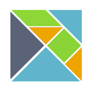
So here are my 2 cents. I'm terrible at graphic design (I'm just an engineer) and this is of course a draft that I hope someone will take further.
For the color scheme, I took images of a glacier and extracted some colors. This would be my "main color" suggestion.
I took another image of an emerald glacier and extracted shades of green - I think it's called teal.
Finally, I got an image of an iced coffee and exrtacted shades of orange / brown.
As per the logo, I think I'm on to something. These are the result of my first iteration. I'm willing to add some sort of gradient to the ice cubes when I can figure out how to do that in Inkscape.
I think it's simple enough. A cool logo should never be complex as evidenced by the "possible inspirations" part, and should work in a monochrome context (both black and white), which I think is kind of the case here.
What are your thoughts ? Any help welcome! 🙏
The text was updated successfully, but these errors were encountered: