Warning
This project is unmaintained.
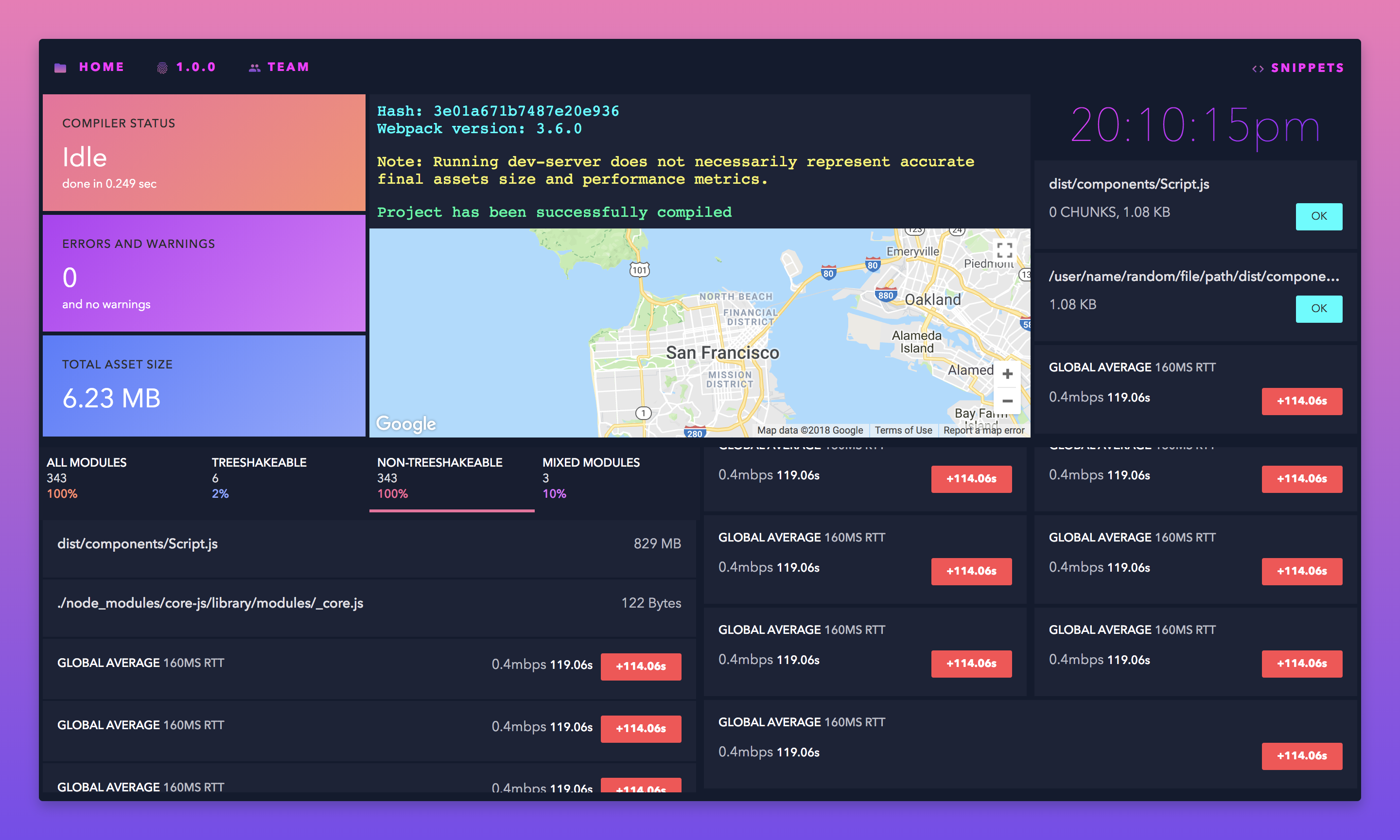
A ✨ dazzling 💫 dashboard that works for you
- Built with React + Next. Use any React component as a dashboard object 🍡
- Pre-cooked on the server for instant page loads with SSR 🍳
- Includes basic components to fill your first board 🍇
# Clone the repository
$ git clone https://github.com/Dazzboard/dazzboard.git
$ cd dazzboard

# Install dependencies
$ npm install

# Run Development
$ npm run dev
npm start
Opens at localhost:3000
A container for holding a singular componentized element.
[background, badge, direction, fill, text, title, subtitle, subtext, width, wrap]
A collection of <Dash /> elements representing a single dashboard. Nest multiple to add more Dazzboards.
(also <DashGroup />, <DashList />, <DashTabs />)
[width]
A container for multiple <Dash /> elements.
(also <DashGroup />, <DashList />, <DashTabs />)
[color, height, title, width]
A container for multiple <Dash /> elements, displayed in a compact format.
[color, height, title, width]
A container for multiple <DashGroup /> elements to create a tabbed list.
[height, width]
A colorful <Dash /> element with simpler API.
[background, text, title, subtext, width]
A simple monospace text wrapper
[color]
Type: string
The CSS background value for the element.
background='linear-gradient(315deg, #df74f9, #b72cf6)'Type: object
Add a colored badge to a <Dash /> element. Options are success and error.
badge={{ success: {text: 'OK', link: '#'}, error: {text: 'Alert!', link: '#'}}}Type: string
Hex color for the highlight color or title color of an element.
'row' || 'column'
Set the Flexbox flex-direction.
Type: bool
For stretching an element to fit it's container.
fill='true'Type: string
Defines the element height.
height='300px'Type: number || array
Defines a responsive element width. Use an array to define widths at multiple breakpoints. More info in the Rebass docs.
width={[1, 1, 1, 1/4]}Type: bool
Sets the Flexbox flex-wrap.
wrap='true'Type: string
Dash text content properties.

