I will slowly but surely add interesting widgets, classes and methods to this package.
Despite the package name, they are not only related to layout. Here they are:
| Layout | Behavioral | Special | Format and Style |
|---|---|---|---|
| SideBySide arranges widgets horizontally. It does things Row and RowSuper can't do. | Delayed gives a widget some initial value, then change it to another value after some delay. | DetectScroll helps modify widgets when a scrollable is scrolled, or a scrollbar is visible. | MaskFunctionTextInputFormatter formats the text to a mask, as the user types, but the mask may change according to what is typed. |
| RowSuper is a row layout that does things the Row widget can't do. | CaptureGestures captures gestures, preventing its parent and ascending subtree to detect them. | ButtonBarSuper is a button-bar that places its buttons differently. | NonUniformOutlineInputBorder can be used to style the borders of TextFields and Containers, but hiding some of the borders. |
| ColumnSuper is a column layout that does things the Column widget can't do. | KeyboardDismiss implements iOS and Android keyboard dismissing behavior. | Button turns any widget into a button, with configurable click-area and the visual feedback. | NonUniformRoundedRectangleBorder can be used to style the borders of Buttons and Containers, but hiding some of the borders. |
| WrapSuper is similar to the Wrap widget, but you can choose the line-breaking algorithm. | showDialogSuper creates a dialog with a callback for when the dialog is dismissed. | CircleButton is a circular icon-button that lets you have a larger click-area and prolong the visual feedback. | FitHorizontally shrinks its child horizontally only, until a shrink limit is reached. |
| Box has features of Container, SizedBox and ColoredBox, but less verbose and can be made const. | showCupertinoDialogSuper creates a Cupertino dialog with a callback for when the dialog is dismissed. | GlobalValueKey is a global key that uses equality instead of identity. Like ValueKey, but global. | TextOneLine is a text widget that fixes this issue. |
| Pad is an EdgeInsetsGeometry which is easier to type and remember. | TimeBuilder lets you implement clocks, countdowns, stopwatches etc, the right way. | GlobalStringKey is a global key created from a String. | |
| NormalizedOverflowBox is an OverflowBox that throws no errors and is easier to use. | ScrollShadow adds dynamic top and bottom shadows to a scrollable widget, to indicate overflow content. |
Note the widgets you don't use will be removed by Flutter's tree shaking. So feel free to add this package to your project even if you want to use only a few of its widgets.
The SideBySide widget arranges it children widgets horizontally,
achieving a layout that is not possible with Row or RowSuper widgets.
The first widget in its children will be on the left, and will occupy as much
horizontal space as it wants, up to the available horizontal space.
The next widgets will be displayed to the right of the previous widget,
and so on, until they run out of space.
The widgets that have no space left will not be displayed (will be sized as 0 width).
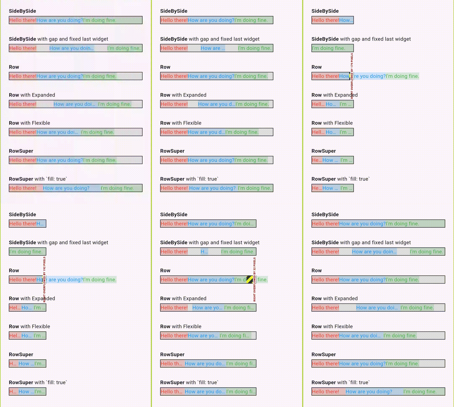
Here is a visual the comparison between SideBySide, Row and RowSuper:
The above animation was created using this example.
Suppose you want to display three texts in a Row with
Row(children: [Text("Heelo there!"), Text("How are you doing?"), Text("I'm doing fine.")]).
If the available horizontal space is not enough, the row will overflow.
You can fix this by wrapping the texts in Expanded widgets,
but then each text will now occupy a third of the available space.
If instead you use Flexible to wrap the texts, the texts now can be smaller,
but not larger than a third of the available space.
If instead of a Row you use SideBySide, the texts will occupy only the space they
need, except for those that don't fit, which will now be hidden.
In the animation, you can also see that SideBySide gives you the option of fixing the
width of the last widget. It even removes gaps automatically (if you use them) as
necessary to save space.
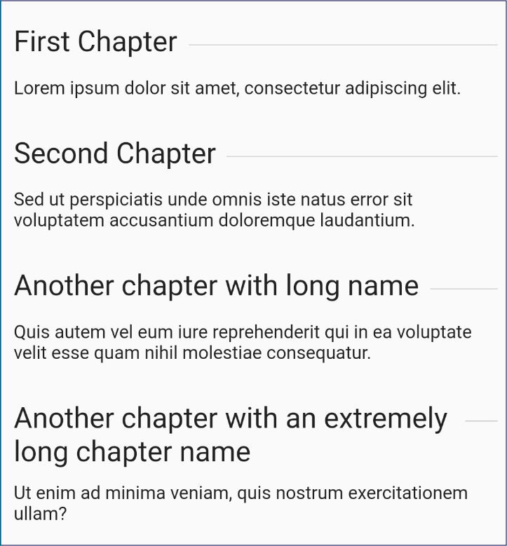
Suppose you want to create a title aligned to the left, with a divider that occupies the rest of the space. You want the distance between the title and the divider to be at least 8 pixels, and you want the divider to occupy at least 20 pixels of horizontal space:
return SideBySide(
  children: [
    Text("First Chapter", textWidthBasis: TextWidthBasis.longestLine),
    Divider(color: Colors.grey),
  ],
  gaps: [8.0],
  minEndChildWidth: 20.0,
);
Another example, with 3 widgets:
return SideBySide(
   children: [
     Text("Hello!", textWidthBasis: TextWidthBasis.longestLine),
     Text("How are you?", textWidthBasis: TextWidthBasis.longestLine),
     Text("I'm good, thank you.", textWidthBasis: TextWidthBasis.longestLine),
   ],
   gaps: [8.0, 12.0],
);
The last widget in children is an is a special case, for two reasons. First,
it will be given all the remaining horizontal space, after the previous widgets
have been displayed. This means you can align it to the right if you want:
SideBySide(
   children: [
      const Text("Some text", textWidthBasis: TextWidthBasis.longestLine),
      Align(
         alignment: Alignment.centerRight,
         child: const Text("more text", textWidthBasis: TextWidthBasis.longestLine),
      ),
   ],
);
Second, you can specify the minimum width that it should occupy, using
the minEndChildWidth parameter. This means that the last widget will occupy
AT LEAST that width, even if it means that the previous widgets will be pushed out
of the available space. However, if the total available space is less
than minEndChildWidth, then the last widget will be displayed only up to the
available space.
You can add gaps between the children widgets, by using the gaps parameter.
The gaps are a list of doubles representing pixels. If you have two children, you should
provide one gap. If you have three children, you should provide two gaps, and so on.
Note the gaps can be negative, in which case the widgets will overlap.
If you provide less than the required number of gaps, the last gap will be used for all the remaining widgets. If you provide more gaps than required, the extra gaps will be ignored.
The crossAxisAlignment parameter specifies how to align the widgets vertically.
The default is to center them. At the moment, only CrossAxisAlignment.start,
CrossAxisAlignment.end and CrossAxisAlignment.center work. If you provide
CrossAxisAlignment.baseline or CrossAxisAlignment.stretch, you'll get
an UnimplementedError.
The mainAxisSize property determines whether the widget will occupy the full
available width (MainAxisSize.max) or only as much as it needs (MainAxisSize.min).
The textDirection parameter controls the direction that children are rendered in.
TextDirection.ltr is the default direction, so the first child is rendered to the left,
with subsequent children following to the right. If you want to order children in the
opposite direction (right to left), then use TextDirection.rtl.
This can be used with RTL (right to left) languages, but also when you want to align children to the right.
When you use Text widgets in your children, it's strongly recommended that
you use parameter textWidthBasis: TextWidthBasis.longestLine. The default
for this param is usually textWidthBasis: TextWidthBasis.parent, which
is almost never what you want. In other words, instead of writing
Text("Hello"), you should probably write
Text("Hello", textWidthBasis: TextWidthBasis.longestLine).
Try running the SideBySide example.
Given a list of children widgets, this will arrange them in a row. It can overlap cells, add separators and more.
RowSuper({
  List<Widget> children,
  double outerDistance,
  double innerDistance,
  bool invert,
  Alignment alignment,
  Widget separator,
  bool separatorOnTop,
  bool fitHorizontally,
  double shrinkLimit,
  MainAxisSize mainAxisSize,
});
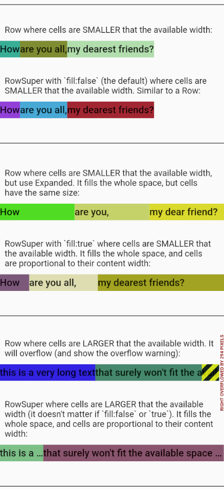
On contrary to ColumnSuper and the native Row
(which will overflow if the children are too large to fit the available free space),
RowSuper may resize its children proportionately to their minimum intrinsic width.
Try running the RowSuper example.
Also, try RowSuper Playground.
Most parameters are the same as the ones of ColumnSuper, except:
-
fillif true will force the children to grow their widths proportionately to their minimum intrinsic width, so that they fill the whole row width. This parameter is only useful if the children are not wide enough to fill the whole row width. In case the children are larger than the row width, they will always shrink proportionately to their minimum intrinsic width, and thefillparameter will be ignored. See: RowSuper Fill example. -
fitHorizontallyif true will shrink the children, horizontally only, until theshrinkLimitis reached. This parameter is only useful if the children are too wide to fit the row width. Avoid usingfitHorizontallytogether withfill: true. -
shrinkLimitby default is 67%, which means the cell contents will shrink until 67% of their original width, and then overflow. MakeshrinkLimitequal to0.0if you want the cell contents to shrink with no limits. Note, iffitHorizontallyis false, theshrinkLimitis not used. -
mainAxisSizeby default isMainAxisSize.min, which means the row will occupy no more than its content's width. Make itMainAxisSize.maxto expand the row to occupy the whole horizontal space.
You can also use a RowSpacer to add empty space (if available) between cells.
For example:
RowSuper(
  children: [
    widget1,
    RowSpacer(),
    widget2,
    widget3,
    ],
);
Try running the RowSuper with FitHorizontally example.
Note: This is not a substitute for Flutter's native Row, it doesn't try to have a
similar API, and it doesn't do all that Row does. In special, Expanded and Flexible
widgets don't work inside of RowSuper, since RowSuper will resize cells
proportionately when content doesn't fit. RowSuper is meant only for certain use cases
where Row won't work, like when you need overlapping cells, or when you need to scale
the contents of the cells when they don't fit.
Given a list of children widgets, this will arrange them in a column. It can overlap cells, add separators and more.
ColumnSuper({
  List<Widget> children,
  double outerDistance,
  double innerDistance,
  bool invert,
  Alignment alignment,
  Widget separator,
  bool separatorOnTop,
  bool removeChildrenWithNoHeight,
});
-
childrenis the list of widgets that represent the column cells, just like in a regularColumnwidget. However, the list may containnulls, which will be ignored. -
outerDistanceis the distance in pixels before the first and after the last widget. It can be negative, in which case the cells will overflow the column (without any overflow warnings). -
innerDistanceis the distance in pixels between the cells. It can be negative, in which case the cells will overlap. -
invertif true will paint the cells that come later on top of the ones that came before. This is specially useful when cells overlap (negativeinnerDistance). -
alignmentwill align the cells horizontally if they are smaller than the available horizontal space. -
separatoris a widget which will be painted between each cell. Its height doesn't matter, since the distance between cells is given byinnerDistance(in other words, separators don't occupy space). The separator may overflow if its width is larger than the column's width. -
separatorOnTopiftrue(the default) will paint the separator on top of the cells. Iffalsewill paint the separator below the cells. -
removeChildrenWithNoHeightif true, children with zero height will not result in an extrainnerDistanceandseparator. If all children have zero height, theouterDistancewill also be removed. In other words, it's as if children with zero height are removed, except for the fact they still occupy width. The default is false. See this interactive example.
Note: This is not a substitute for Flutter's native Column, it doesn't try to have a
similar API, and it doesn't do all that Column does. In special, Expanded
and Flexible widgets don't work inside of ColumnSuper, and it will overflow if the
column is not big enough to fit its contents. ColumnSuper is meant only for certain use
cases where Column won't work, like when you need overlapping cells or separators.
Try running the ColumnSuper example.
Also, try ColumnSuper Playground.
FitHorizontally({
  Widget child,
  double shrinkLimit,
  bool fitsHeight,
  AlignmentGeometry alignment,
});
The child will be asked to define its own intrinsic height. If fitsHeight is true, the
child will be proportionately resized (keeping its aspect ratio)
to fit the available height.
Then, if the child doesn't fit the width, it will be shrinked horizontally only (not
keeping its aspect ratio) until it fits, unless shrinkLimit is larger than zero, in
which case it will shrink only until that limit. Note if shrinkLimit is 1.0 the child
will not shrink at all. The default is 0.67 (67%).
This is specially useful for text that is displayed in a single line. When text doesn't
fit the container it will shrink only horizontally, until it reaches the shrink limit.
From that point on it will clip, display ellipsis or fade, according to the
text's Text.overflow property.
Note: FitHorizontally with shrinkLimit 0.0 is not the same as FittedBox
with BoxFit.fitWidth, because FitHorizontally will only scale horizontally,
while FittedBox will maintain the aspect ratio.
Try running the FitHorizontally example.
Box has features of Container, SizedBox and ColoredBox:
- Unlike a `Container` it can be `const`.
- Unlike a `ColoredBox` it can have size and padding.
- Unlike a `SizedBox` it can have color and padding.
const Box({
  bool show = true,
  Color color,
  EdgeInsetsGeometry padding,
  double width,
  double height,
  Alignment alignment,
  Widget child,
  Decoration decoration,
  DecorationPosition decorationPosition,
});
Usage example:
const Box(color: Colors.red, width: 50, height:30);
Box allows you to make const large blocks of code. For example, the following code
couldn't be const if we were to use a Container, a SizedBox or a ColoredBox:
static const progressIndicator =
  Opacity(
    opacity: 0.6,
    child: Box( // Can't use Container, SizedBox or ColoredBox.
      color: Colors.blue,
      alignment: Alignment.center,
      decoration: BoxDecoration(
          border: Border.symmetric(
            horizontal: BorderSide(color: Colors.green, width: 16),
          ),
      child: Padding(
          padding: Pad(all: 5.0),
          child: AspectRatio(
              aspectRatio: 1,
              child: CircularProgressIndicator(
                  valueColor: AlwaysStoppedAnimation<Color>(Colors.white)))),),);}
Note: Const objects are final/immutable and created in compile time. So you don't waste
time creating them. Also, all const objects of the same type with the same parameters are
the same instance. So you don't waste memory creating more than one of them. In other
words, const objects make your program faster and more memory efficient. They can also be
used as default values in constructors, and they work well with hot-reload, while final
values do not.
Note: The Box is a little more flexible than the Container when you define both a
color and a BoxDecoration (or ShapeDecoration) at the same time. The Box will
only throw an error if the color is defined twice. If you define it only once, you can do
it inside or outside the decoration:
// Both are valid:
Box(color: Colors.blue, decoration: BoxDecoration(border: Border.all()));
Box(decoration: BoxDecoration(color: Colors.blue, border: Border.all()));
-
You can use
Box.gap()to create a small square as a gap between widgets:Column( children: [ Text('A'), const Box.gap(8), // 8.0 pixel gap Text('B'), ]); -
You can use the
Padclass (provided in this package) for thepadding, instead ofEdgeInsets. For example:Box(padding: Pad(horizontal: 8, top: 20)); -
You can hide the box and its contents, by making the
show: false. -
If you make
removePaddingWhenNoChild: true, thepaddingis only applied if the child is not null. If thechildisnullandwidthandheightare alsonull, this means the box will occupy no space (will be hidden). -
You can change a box with the
copyWithmethod. For example:myBox.copyWith(color: Colors.blue); -
You can create boxes by adding a
Boxto one these types:bool,Color,EdgeInsetsGeometry,AlignmentGeometry, orWidget:// To hide the box: Box(...) + false; // To show the box: Box(...) + true; // To change the box color: Box(...) + Colors.green; // To change the box padding: Box(...) + Pad(all: 10); // To substitute the box child: Box(...) + Text('abc'); // To put a box inside of another: Box(...) + Box(...); // Adding null returns the same box: Box(...) + null; -
You can use methods
Box.add()andBox.subtract()to add or remove width and height from the box. For example:Box(width: 100, height: 100).add(width: 20);
-
If you need to quickly and temporarily add a color to your box so that you can see it, you can use the constructors
Box.rfor red,Box.gfor green,Box.bfor blue, andBox.yfor yellow.Box(child: myChild); Box.r(child: myChild); Box.g(child: myChild); Box.b(child: myChild); Box.y(child: myChild); -
If you want to see rebuilds, you can use the
Box.randconstructor. It will then change its color to a random one, whenever its build method is called.Box.rand(child: myChild);
All these debugging constructors are marked as deprecated so that you don't forget to remove them.
WrapSuper is similar to the native Wrap widget with direction = Axis.horizontal, but
it allows you to choose between different
line-breaking
algorithms.
WrapSuper displays its children in lines. It will leave spacing horizontal space
between each child, and it will leave lineSpacing vertical space between each line. The
contents of each line will then be aligned according to the alignment. The algorithm for
the line-breaks is chosen by wrapType.
WrapSuper({
  Key key,
  WrapType wrapType,
  double spacing,
  double lineSpacing,
  WrapSuperAlignment alignment,
  List<Widget> children,
});
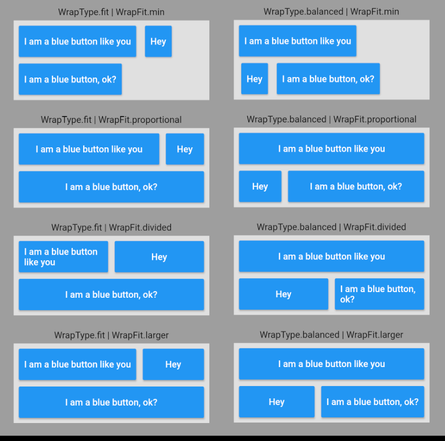
WrapSuper with WrapType.fit uses a
greedy algorithm for line
breaks, which is the same one used by the native Wrap widget.
However, WrapSuper with WrapType.balanced (the default) uses a
minimum
raggedness algorithm
for line breaks. It will position its child widgets in the same number of lines as the
greedy algorithm, but these lines will tend to be more similar in width.
For example:
- Here is my original StackOverflow question that resulted in this widget.
-
The algorithm I used was based on this one (Divide and Conquer), which always considers
spacing: 1.0. It was changed (with the help of CodeChef) to allow for other spacings. -
Add your thumbs up here if you want native
Textwidgets to also allow for better line-breaks.
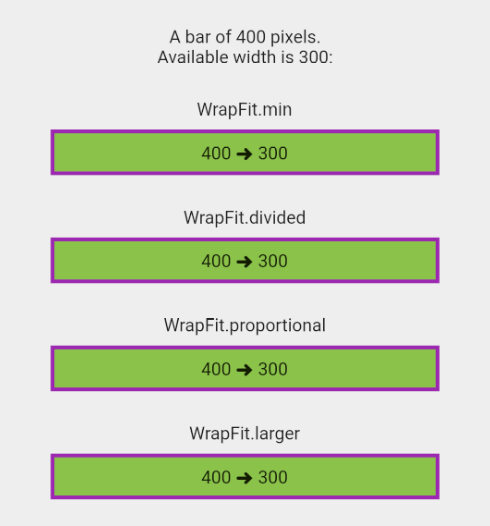
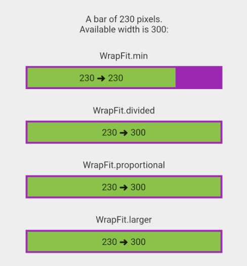
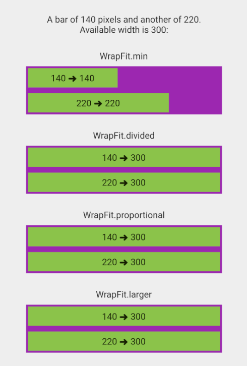
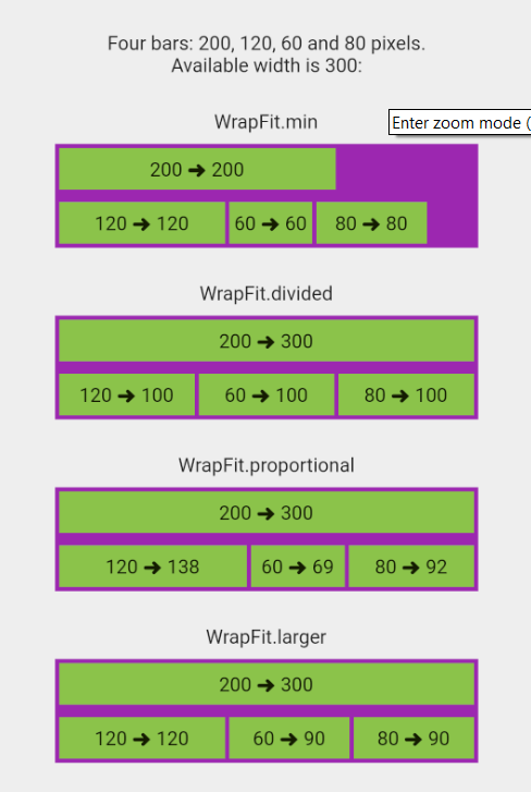
After WrapSuper distributes its children in each line, the wrapFit parameter defines
the width of the widgets:
-
min(the default) will keep each widget's original width. -
dividedwill make widgets fit all the available horizontal space. All widgets in a line will have the same width, even if it makes them smaller that their original width. -
proportionalwill make widgets larger, so that they fit all the available space. Each widget width will be proportional to their original width. -
largerwill make widgets larger, so that they fit all the available space. Will try to make all widgets the same width, but won't make any widgets smaller than their original width. In more detail: 1) First, divide the available line width by the number of widgets in the line. That is the preferred width. 2) Keep the width of all widgets larger than that preferred width. 3) Calculate the remaining width and divide it equally by the remaining widgets.
Some examples:
Try running the WrapFit example.
The DetectScroll widget can detect if the content of a Scrollable is larger than the
Scrollable itself, which means that the content can be scrolled, and that a scrollbar
is likely visible. It can also tell you the probable width of that scrollbar.
This is useful for positioning widgets relative to the scrollbar, so that the scrollbar doesn't overlap them. This can be important when the scrollbar is permanently visible, usually on the Web and desktop.
Note that DetectScroll will only detect the scrolling of its closest scrollable
descendant (a scrollable is a SingleChildScrollView, ListView, GridView etc).
Usually, you'd wrap the scrollable you care about directly with a DetectScroll.
For example:
DetectScroll(
 child: SingleChildScrollView(
    child: Column( ...
 ...
);
To get the current scroll state and the scrollbar width, descendants can call:
bool canScroll = DetectScroll.of(context).canScroll;
double scrollbarWidth = DetectScroll.of(context).scrollbarWidth;
For example, suppose you want to add a help button to the top-right corner of a scrollable, and account for the scrollbar width only if it's visible:
bool canScroll = DetectScroll.of(context).canScroll;
double scrollbarWidth = DetectScroll.of(context).scrollbarWidth;

return Stack(
  children: [
     child,
     Positioned(
        right: canScroll ? scrollbarWidth : 0,
        top: 0,
        child: HelpButton(),
     ),
  ],
);
Another alternative is using the optional onChange callback of the DetectScroll:
DetectScroll(
   onChange: ({
      required bool canScroll,
      required double scrollbarWidth,
   }) {
      // Do something.
   }
   child: ...
),
Try running the DetectScroll example.
The DetectScroll actually only detects if its subtree can scroll, in other words,
that its closest descendant Scrollable has enough content so that not all of it
fits the available visible space, and then informs its descendants about this fact.
Note this doesn't mean there is actually a scrollbar visible, but only that the content can be scrolled. For this reason, you should use it to detect scrollbars only when a scrollbar is always shown when the content doesn't fit (like on the web or desktop), or when you're using a custom scrollbar that is always visible.
Regarding the width of the scrollbar provided by DetectScroll, this information
is calculated from the current theme at the DetectScroll. For this reason,
if you use this width, make sure the scrollbar is actually using this same theme.
ButtonBarSuper has a similar API to a regular ButtonBar, but will distribute its
buttons by using a WrapSuper.
The default (which may be changed) is WrapType.balanced and WrapFit.larger, which
means it will distribute the buttons in as little lines as possible in a balanced way;
will make the buttons fill all the available horizontal space; and will try to make
buttons have similar width in each line, without reducing their widths.
Try running the ButtonBarSuper example.
TextOneLine is a substitute for Text when maxLines: 1, to fix this issue:
flutter/flutter#18761 filled by myself a long time ago.
It renders ellipsis as expected, much better than the current/ buggy and ugly-looking
ellipsis of the native Text widget, which cuts the whole word.
For example, this:
Text("This isAVeryLongWordToDemonstrateAProblem", maxLines: 1, softWrap: false);
Will print this in the screen:
This ...
While this:
TextOneLine("This isAVeryLongWordToDemonstrateAProblem");
Will print this:
This isAVeryLongWordToDemonst...
Delayed can be used to give a widget some initial value, and then, after some delay,
change it to another value. As we'll see, Delayed is specially useful when used
with implicitly animated widgets.
As soon as Delayed is inserted into the tree, it will build the widget returned
by builder with initialized==false. Then:
-
If
delayisnull, it will rebuild withinitialized==truein the next frame (usually 16 milliseconds later). -
If
delayis NOT null, it will rebuild withinitialized==trueafter that delay.
For example, this shows a widget after a 2 seconds delay:
Delayed(delay: const Duration(seconds: 2),
  builder: (context, bool initialized) =>
    initialized
      ? Container(color: Colors.red, width: 50, height: 50)
      : SizedBox()));
For example, this changes a widget color after a 3 seconds delay:
Delayed(delay: const Duration(seconds: 3),
  builder: (context, bool initialized) =>
    Container(color: initialized ? Colors.red : Colors.blue,
              width: 50,
              height: 50)
    )
)
For example, this will fade-in a widget as soon as it enters the screen:
Delayed(
  builder: (context, bool initialized) =>
    AnimatedOpacity(opacity: initialized ? 1.0 : 0.0,
                    duration: const Duration(seconds: 1),
                    child: MyWidget()
    )
);
For example, this will fade-in a widget 300 milliseconds after it enters the screen:
Delayed(delay: const Duration(milliseconds: 300),
  builder: (context, bool initialized) =>
    AnimatedOpacity(opacity: initialized ? 1.0 : 0.0,
                    duration: const Duration(seconds: 1),
                    child: MyWidget()
    )
);
Try running the Delayed example.
Pad is an EdgeInsetsGeometry which is easy to type and remember.
It can be used in all widgets that accept padding, like Container, Padding and
Box.
For example, instead of writing padding: EdgeInsets.symmetric(vertical: 12)
you can write simply padding: Pad(vertical: 12).
More examples:
// Zero padding
Pad()

// Instead of EdgeInsets.all(12)
Pad(all: 12)

// Instead of EdgeInsets.only(top: 8, bottom: 8, left: 4, right: 2)
Pad(top: 8, bottom: 8, left: 4, right: 2)

// Instead of EdgeInsets.symmetric(vertical: 12)
Pad(vertical: 12)

// Instead of EdgeInsets.symmetric(vertical: 12, horizontal: 6)
Pad(vertical: 12, horizontal: 6)
You can also compose paddings. For example, if you want 40 pixels of padding in all
directions, except the top with 50 pixels: padding: Pad(all: 40, top: 10).
During development, you sometimes need to temporarily remove the padding,
for debugging reasons.
Unfortunately you can't just comment the padding parameter, because the
Padding widget doesn't accept null padding. But you can just add .x to the
Pad class to remove it. It's marked as deprecated so that you don't forget to change
it back to normal:
// This is the same as Pad.zero.
padding: Pad.x(top: 8, bottom: 8, left: 4)
You can also use plus and minus and copyWith:
// Same as Pad(all: 40, bottom: 10)
Pad(all: 40).plus(bottom: 10);

// Same as Pad(all: 40, bottom: -10)
Pad(all: 40).minus(bottom: 10);

// Same as Pad(left: 40, right: 40, top: 40, bottom: 10)
Pad(all: 40).copyWith(bottom: 10);
A NormalizedOverflowBox is a widget that imposes different constraints on its child
than it gets from its parent, possibly allowing the child to overflow the parent.
A NormalizedOverflowBox is similar to an OverflowBox. However, then OverflowBox may
throw errors if it gets constraints which are incompatible with its own constraints. For
example, if an OverflowBox is inside a container with maxWidth 100, and its
own minWidth is 150, it will throw:
The following assertion was thrown during performLayout():
BoxConstraints has non-normalized width constraints.
The NormalizedOverflowBox, on the other hand, will just make sure maxWidth is also 150
in the above example, and throw no errors. In other words, a NormalizedOverflowBox is
safer to use, and in my opinion has the behavior OverflowBox should have had.
Try running
the
NormalizedOverflowBox Example. Then substitute the NormalizedOverflowBoxs with
regular OverflowBoxes and see where it fails.
Functions showDialogSuper and showCupertinoDialogSuper are identical to the
native showDialog and showCupertinoDialog, except that they let you define
an onDismissed callback for when the dialog is dismissed:
showDialogSuper(
   context: context,
   onDismissed: (dynamic result) { print("Dialog dismissed"); }
   builder: ...
}
Usually there are 3 ways to close a dialog:
- Pressing some button on the dialog that closes it (usually by calling
Navigator.pop(context)). - Tapping the barrier.
- Pressing the Android back button.
All three ways will result in the onDismissed callback being called.
However, when the dialog is popped by Navigator.of(context).pop(result) you will get
the result in the onDismissed callback. That way you can differentiate between the
dialog being dismissed by an Ok or a Cancel button. The result is null when the dialog
is dismissed by tapping the barrier or pressing BACK in Android. Example:
showDialogSuper<int>(
...
  actions: [
    ElevatedButton( onPressed: (){Navigator.pop(context, 1);}, child: const Text("OK"),
    ElevatedButton( onPressed: (){Navigator.pop(context, 2);}, child: const Text("CANCEL"),
  ]
  ...
  onDismissed: (int? result) {
    if (result == 1) print("Pressed the OK button.");
    else if (result == 2) print("Pressed the CANCEL button.");
    else if (result == null) print("Dismissed with BACK or tapping the barrier.");
  });
This method was created to solve this issue: flutter/flutter#26542 filled by myself a long time ago.
Try running the showDialogSuper Example.
If you need some widget to change periodically (clocks, countdowns, stopwatches etc.),
one way of implementing this is using a Timer to rebuild it. This is, however, very
inefficient and may make your app slow.
The TimeBuilder widget gives you the correct implementation of periodic rebuilds. It's
based on
Remi
Rousselet's code and you can
read all about it here.
Apart from better performance, using the TimeBuilder widget has the following
advantages:
-
Compatible with DevTools "slow animations", which reduce the speed of
AnimationControllers. -
Compatible with
Clockchanges, allowing for testing (skip frames to target a specific moment in time). -
The
TimeBuilderwidget animation is "muted" when the widget is not visible. For example, when the widget is a route that is currently not visible, or because of an ancestor widget such asVisibility.
Let's see some examples.
To create a countdown in seconds from a certain DateTime:
// 100 seconds countdown.
TimeBuilder.countdown(
   start: DateTime.now(),
   seconds: 100,
   builder: ({
      required BuildContext context,
      required DateTime currentTickTime,
      required DateTime initialTime,
      required int ticks,
      required bool isFinished,
      required int countdown,
   }) => Text(isFinished ? "FINISHED" : countdown.toString()),
);
To create a clock that ticks once per second, you can use the .eachSecond constructor:
TimeBuilder.eachSecond(
   builder: ({
      required BuildContext context,
      required DateTime currentTickTime,
      required DateTime initialTime,
      required int ticks,
      required bool isFinished
   }) => MyClock(currentTickTime),
);
If you want the rebuilds to stop after 30 seconds you can add the seconds parameter:
TimeBuilder.eachSecond(
   seconds: 30,
   builder: ({
      required BuildContext context,
      required DateTime currentTickTime,
      required DateTime initialTime,
      required int ticks,
      required bool isFinished
   }) => MyClock(currentTickTime),
);
There are also .eachMillisecond, .eachMinute, .eachHour and .eachFrame
constructors.
You can also create your own TimeBuilder using the default constructor:
const TimeBuilder({
   Key? key,
    required this.builder,
    required this.ifShouldTickAndRebuild,
    this.isFinished,
}) : super(key: key);
You must provide the builder and ifShouldTickAndRebuild callbacks.
For each frame, Flutter will first call your ifShouldTickAndRebuild callback,
which may return true or false:
typedef IfShouldTickAndRebuild = bool Function({

  /// The current time.
  required DateTime currentTime,

  /// The time of the last tick (is `null` for the first tick).
  required DateTime? lastTickTime,

  /// The time when the [TimeBuilder] was created.
  required DateTime initialTime,

  /// The number of ticks since the [TimeBuilder] was created.
  required int ticks,
});
Only when it returns true, the builder will be asked to generate a widget.
The builder callback is of type TimeBuilderBuilder:
typedef TimeBuilderBuilder = Widget Function({
  required BuildContext context,

  /// The time of the current tick. Same as the current time (or very similar).
  required DateTime currentTickTime,

  /// The time when the [TimeBuilder] was created.
  required DateTime initialTime,

  /// The number of ticks since the timer started.
  required int ticks,

  /// This is `false` while the [TimeBuilder] is ticking. Is `true` when finished.
  required bool isFinished,
});
There is also the optional isFinished callback. Returning true there will generate
one last rebuild, and then stop the animation for good (no more ticks and rebuilds).
In the example below, the given text will be displayed one character at a time,
as if it was being typed. The typing starts after a startDelay duration,
and each character is typed every charDuration:
class TypewriterText extends StatelessWidget {
  final String text;
  final Duration charDuration;
  final Duration startDelay;
  final TextStyle textStyle;

  const TypewriterText({
    Key? key,
    required this.text,
    required this.charDuration,
    required this.startDelay,
    required this.textStyle,
  }) : super(key: key);

  @override
  Widget build(BuildContext context) {
    final int totalTicks = text.length;

    return TimeBuilder(

      builder: ({ ... }) {
        // One char per tick.
        final visibleText = text.substring(0, ticks.clamp(0, text.length));

        return Text(visibleText, style: textStyle);
      },

      isFinished: ({ ..., required int ticks }) {
        // Finish when reaching the total number of ticks/chars.
        return ticks >= totalTicks;
      },

      ifShouldTickAndRebuild: ({
        required DateTime currentTime,
        required DateTime? lastTickTime,
        required DateTime initialTime,
        required int ticks,
      }) {
        // Delay animation by the `startDelay`.
        final Duration elapsedStart = currentTime.difference(initialTime);
        if (elapsedStart < startDelay) return false;

        // Rebuild periodically based on the `charDuration`.
        final Duration elapsedLastTick = currentTime.difference(lastTickTime ?? currentTime);
        return elapsedLastTick >= charDuration;
      },
    );
  }
}
For local keys, Flutter provides ObjectKey and ValueKey. But for global keys,
it provides only GlobalObjectKey, which compares by identity:
Key keyA = GlobalObjectKey('1' + '23');
Key keyB = GlobalObjectKey('12' + '3');

keyA == keyA; // true
keyA == keyB; // false
This package provides a GlobalValueKey to compare by equality (using operator ==).
For example:
Key keyA = GlobalValueKey('1' + '23');
Key keyB = GlobalValueKey('12' + '3');

keyA == keyA; // true
keyA == keyB; // also true
If your key value is a String, you can also use a GlobalStringKey:
Key keyA = GlobalStringKey('1' + '23');
Key keyB = GlobalStringKey('12' + '3');

keyA == keyA; // true
keyA == keyB; // also true
There are many use cases for the GlobalValueKey, but I'd like to point out two in
particular:
Flutter's documentation for global keys states that:
/// Creating a new GlobalKey on every build will throw away the state of the
/// subtree associated with the old key and create a new fresh subtree for the
/// new key. Besides harming performance, this can also cause unexpected
/// behavior in widgets in the subtree. For example, a [GestureDetector] in the
/// subtree will be unable to track ongoing gestures since it will be recreated
/// on each build.
///
/// Instead, a good practice is to let a State object own the GlobalKey, and
/// instantiate it outside the build method, such as in [State.initState].
However, this is only correct for Flutter's native GlobalObjectKey. The keys provided
here in this package can indeed be recreated on every build with no problems (as long, of
course, as the value you use to create the key has a well-behaved operator ==).
Suppose you want to derive keys from data classes, and then find widgets that correspond
to them. For example, you have a User data class:
class User {
  final String name;
  User(this.name);
  bool operator ==(Object other) => identical(this, other) || other is User && runtimeType == other.runtimeType && name == other.name;
  int get hashCode => name.hashCode;
}
Then you create a widget class from it:
class UserWidget extends StatefulWidget {
  final User user;
  UserWidget({required this.user});
  State<UserWidget> createState() => UserWidgetState();
}

class UserWidgetState extends State<UserWidget> {
  Widget build(BuildContext context) => Text(widget.user.name);
}
To be able to find the user widget in the tree, modify your constructor as to create keys automatically, from the user:
UserWidget({required this.user}) : super(key: GlobalValueKey<UserWidgetState>(user));
And then, create a static method for easy access to the widget state:
static UserWidgetState? currentState(User user) =>
  GlobalValueKey<UserWidgetState>(user).currentState;
You now have easy access to your widget state, from anywhere:
UserWidget.currentState(someUser)
You can find a complete working example here.
Global keys much more powerful than local keys, but in general, should not be used
extensively. They
are workarounds. I guess that's why Flutter does not provide a GlobalValueKey out of the
box: Not to make global keys even more useful. Flutter has this philosophy that things
that are useful, but can be used wrong, should be made difficult.
In any case, I found that GlobalValueKey can sometimes make complex code orders of
magnitude simpler.
The MaskFunctionTextInputFormatter is a special TextInputFormatter that lets you
format the text
in a TextField or TextFormField as the user types, according to a mask; as well as
also change that mask according to what is typed.
To use it, create your formatter and pass it to a TextField or TextFormField:
TextField(
  inputFormatters: [myFormatter],
);
This code is adapted from another package
called
mask_text_input_formatter
by Sergey. The difference here is that instead of
providing a mask, you provide a maskFunction that can change the mask automatically as
the user types.
The maskFunction is of type MaskFunction:
typedef MaskFunction = String? Function({
   required TextEditingValue oldValue,
   required TextEditingValue newValue,
});
For example, suppose you want to format the text as ###### (where each # is a number)
while the user typed less than 7 numbers, but you want to format it as ###.###.###-##
for more chars than that:
var myFormatter = MaskFunctionTextInputFormatter(mask: _myFormatter);

String? _myFormatter({
   required TextEditingValue oldValue,
   required TextEditingValue newValue,
}) {
   if (newValue.text.length <= 6) return '######';
   else return '###.###.###-##';
}
When you create the formatter, you can also provide a filter parameter, to define the
possible characters in the mask. If you don't provide the filter parameter, the default
is that # matches a number, and A matches a letter:
var myFormatter = MaskFunctionTextInputFormatter(
   mask: _myFormatter,
   filter: {"#": RegExp('[0-9]'), "A": RegExp('[^0-9]')});
The getMaskedText and getUnmaskedText methods can be used if necessary:
// Get masked text:
print(maskFormatter.getMaskedText()); // -> "+0 (123) 456-78-90"

// Get unmasked text:
print(maskFormatter.getUnmaskedText()); // -> 01234567890
Important: Once again, please note all the above code is based upon mask_text_input_formatter by Sergey. The ONLY thing I added was the possibility of using a function that changes the mask. All the rest is from the original package, and credit belongs to their authors.
The Button widget transforms any widget into a button with some immediate visual
response to a tap. It provides you with a builder, and the isPressed boolean which
tells you if the widget is being touched or not. It can also expand the click-area, show
the click-area (for debug purposes), sustain the visual effect of the tap for some
duration, and accepts a throttle period between taps:
Button(
    onTap: () {...},
    minVisualTapDuration: Duration(milliseconds: 200),
    tapThrottle: Duration(milliseconds: 500),
    clickAreaMargin: const Pad(horizontal: 40, vertical: 20),
    debugShowClickableArea: true,
    builder: ({required bool isPressed}) =>
      Text('Click Me', style: TextStyle(color: isPressed ? Colors.black : Colors.white)),
);
-
When the user taps the button, the
isPressedboolean will be true for at leastminVisualTapDuration. -
The widget will only feel another tap if
tapThrottleduration has passed since the last tap. -
The click-area can be expanded by a margin given by
clickAreaMargin, thus making the widget easier to tap. -
If
debugShowClickableAreais true, the click-area will be shown in red.
Try running the Button and CircleButton example.
The CircleButton is similar to Flutter's native IconButton, but with a few
differences. Since circular buttons are small, the user's finger usually hides it during
the tap. For this reason, the CircleButton will:
-
Show an immediate visual feedback to a tap, and then sustain that feedback for about 100 milliseconds, enough time for the user to remove the finger and see it.
-
You can expand the click-area, to make the button easier to tap and improve usability. You can also show the click-area, for debug purposes.
CircleButton(
    onTap: () {...},
    icon: Icon(Icons.shopping_cart, color: Colors.white),
    clickAreaMargin: const Pad(left: 30, right: 50, vertical: 20),
    debugShowClickableArea: true,
    backgroundColor: Colors.white30,
    tapColor: Colors.black,
    hoverColor: Colors.grey,
    border: Border.all(width: 1, color: Colors.black),
    size: 56,
);
-
The click-area can be expanded by a margin given by
clickAreaMargin, thus making the widget easier to tap. -
If
debugShowClickableAreais true, the click-area will be shown in red.
Try running the Button and CircleButton example.
A widget that captures gestures, preventing its parent (and ascending subtree) to detect them.
How is this different from IgnorePointer and AbsorbPointer?
IgnorePointer makes itself and its child (and the descending subtree) invisible to
touches. This means, for example, if you put the IgnorePointer and its child above some
widget inside a Stack, the touches will "pass through" the IgnorePointer and be felt by
the widget below it. The gesture can also be felt by the IgnorePointer's parent.
AbsorbPointer also makes its child invisible to touches, but it will also prevent
the touch to be felt by widgets below it in a Stack. But the gesture can be felt by
the AbsorbPointer's parent.
As you can see, IgnorePointer and AbsorbPointer act on their children and on widgets
below them in a Stack. However, in both cases the gesture can be felt by their parents.
For example, if you put IgnorePointer or AbsorbPointer inside a ListView, none of
them will prevent the ListView to be scrolled, because the ListView is
in the ascending subtree).
The CaptureGestures however, will let its child feel the touches it cares about,
and then capture and cancel other touches that reach the CaptureGestures itself. This
means the CaptureGestures parent (and all the ascending subtree) will not feel the
touches below the CaptureGestures area.
The parameters for the CaptureGestures.only() constructor are:
capturingTapturns on/off the capturing of tap gestures.capturingDoubleTapturns on/off the capturing of double-tap gestures.capturingLongPressturns on/off the capturing of long-press gestures.capturingVerticalDragturns on/off the capturing of vertical-drag gestures.capturingHorizontalturns on/off the capturing of horizontal-drag gestures.capturingForcePressturns on/off the capturing of force-press gestures.displayprints the captured events to the console (for debug reasons only).
The CaptureGestures.all() constructor will capture all gestures.
The CaptureGestures.tap() constructor will capture only single tap gestures.
The CaptureGestures.scroll() constructor will capture only drag gestures (preventing
both vertical and horizontal scroll).
Consider this code:
ListView(
   children: [
      CaptureGestures.scroll(child: ElevatedButton(...)),
      ...
      ...
   ]
);
Here, the ElevatedButton can feel the onTap gesture that it cares about. But the user
cannot scroll the list by touching the button and dragging it up or down, because the drag
gestures are getting captured by the CaptureGestures, never reaching the ListView.
Note: Setting the scrollable's physics to NeverScrollableScrollPhysics() is also an
option, but sometimes you can't do that. Also, CaptureGestures allows you to choose just
a part of
the widget tree to cancel the scroll.
Try running the CaptureGestures example.
Can be used to style text-fields and containers.
Similar to Flutter's native OutlineInputBorder but you can hide some of the sides, by
setting hideTopSide, hideBottomSide, hideRightSide and hideLeftSide to true.
Usage for text-fields:
TextField(
   decoration: InputDecoration(
      enabledBorder: NonUniformOutlineInputBorder(hideLeftSide: true, ...),
      ...
Usage for containers:
Container(
   decoration: ShapeDecoration(
      shape: NonUniformOutlineInputBorder(
         hideLeftSide: true,
         borderSide: BorderSide(width: 10),
         borderRadius: BorderRadius.only(
            topRight: Radius.circular(15),
            bottomRight: Radius.circular(35),
         ),
   ...
Try running the NonUniformOutlineInputBorder example.
This may be used to style buttons and containers.
Similar to Flutter's native RoundedRectangleBorder but you can hide some of the sides,
by
setting hideTopSide, hideBottomSide, hideRightSide and hideLeftSide to false.
Usage for buttons:
ElevatedButton(
   style: ElevatedButton.styleFrom(
      shape: NonUniformRoundedRectangleBorder(
         hideLeftSide: true,
         side: BorderSide(color: Colors.black87, width: 15),
         borderRadius: BorderRadius.only(
            topLeft: Radius.circular(30),
            bottomLeft: Radius.circular(10),
         ),
      ...
Usage for containers:
Container(
   decoration: ShapeDecoration(
      shape: NonUniformRoundedRectangleBorder(...)),
   ...
Try running the NonUniformRoundedRectangleBorder example.
Wrap your widget tree with a KeyboardDismiss so that:
-
In iOS, if parameter
iOSis true (the default), the keyboard will follow iOS's default behavior:- Keyboard closes when the user taps an empty area of the screen.
- Keyboard closes when the user swipes down from just above the keyboard edge.
- Any focused element will lose focus.
-
In Android, the default behavior is that the keyboard only closes when the user taps the back button or executes the back gesture. However, if you want, you can force the Android to follow some iOS behaviors:
- Pass
androidCloseWhenTaptrue, if you want the keyboard to close when the user taps an empty area of the screen. - Pass
androidCloseWhenSwipetrue, if you want the keyboard to close when the user swipes down from just above the keyboard edge. - Pass
androidLoseFocustrue, if you want any focused element will lose focus.
- Pass
The KeyboardDismiss widget must be put in a place where it has the same size of the
screen.
For example, if you use a Scaffold, the KeyboardDismiss should be above the
scaffold, and not inside the scaffold's body.
A good place to put the KeyboardDismiss widget is in the MaterialApp.builder method,
like so:
MaterialApp(
   builder: (BuildContext context, Widget? child) => KeyboardDismiss(child: child);
ScrollShadow is a Flutter widget that adds shadows to the top and bottom edges of a
scrollable widget to indicate overflow content. The shadows dynamically appear or
disappear based on the scroll state, providing a visual cue that more content can be
revealed in a specific direction.
This widget is highly customizable, allowing you to control the shadow behavior, color, padding, and elevation independently for the top and bottom edges.
- Dynamically display shadows when the content overflows the scrollable area.
- Customize shadow visibility behavior for the top and bottom edges independently.
- Supports
whenScrolled,alwaysOn, andalwaysOffshadow visibility modes. - Control shadow color, elevation, and padding for precise styling.
ScrollShadow(
  topShadowVisibility: ShadowVisibility.whenScrolled,
  bottomShadowVisibility: ShadowVisibility.alwaysOn,
  topShadowColor: Colors.black.withOpacity(0.5),
  bottomShadowColor: Colors.black.withOpacity(0.5),
  elevation: 4.0,
  child: ListView.builder(
    itemCount: 50,
    itemBuilder: (context, index) => ListTile(title: Text('Item $index')),
  ),
);
ScrollShadow({
  required Widget? child,
  double? topRightPadding,
  double? topLeftPadding,
  Radius? topRadius,
  double? bottomRightPadding,
  double? bottomLeftPadding,
  Radius? bottomRadius,
  ShadowVisibility topShadowVisibility = ShadowVisibility.whenScrolled,
  ShadowVisibility bottomShadowVisibility = ShadowVisibility.whenScrolled,
  Color topShadowColor = Colors.black,
  Color bottomShadowColor = Colors.black,
  Color topShadowDividerColor = const Color(0xD0000000),
  Color bottomShadowDividerColor = const Color(0xD0000000),
  double? elevation,
  bool ifHidesShadowForNegativeScroll = false,
  Key? key,
})
-
child: The scrollable widget wrapped byScrollShadow. Typically, this is aListView,SingleChildScrollView,GridView, etc. -
topRightPadding,topLeftPadding: Padding applied to the right and left sides of the top shadow. Defaults to14.0and5.0, respectively. -
topRadius: Radius for rounding the corners of the top shadow. Defaults toRadius.circular(4.0). -
bottomRightPadding,bottomLeftPadding: Padding applied to the right and left sides of the bottom shadow. Defaults to14.0and5.0, respectively. -
bottomRadius: Radius for rounding the corners of the bottom shadow. Defaults toRadius.circular(4.0). -
topShadowVisibility,bottomShadowVisibility: Controls the visibility behavior of the top and bottom shadows. Available options:ShadowVisibility.whenScrolled: Shows the shadow only when the content overflows.ShadowVisibility.alwaysOn: Always displays the shadow.ShadowVisibility.alwaysOff: Never displays the shadow.
-
topShadowColor,bottomShadowColor: Colors for the top and bottom shadows. Defaults toColors.black. -
topShadowDividerColor,bottomShadowDividerColor: Divider colors applied at the top and bottom edges of the shadows. -
elevation: The elevation of the shadows, determining their intensity and blur radius. Defaults to2.5. -
ifHidesShadowForNegativeScroll: Iftrue, hides the shadow when the scroll position is negative (e.g., overscroll). Defaults tofalse.
- Highlighting that more content is available in a scrollable widget.
- Adding visual emphasis to the boundaries of a scrollable area.
- Enhancing the user experience by dynamically indicating overflow content.
ScrollShadow(
  topShadowVisibility: ShadowVisibility.alwaysOn,
  bottomShadowVisibility: ShadowVisibility.whenScrolled,
  topShadowColor: Colors.grey.withOpacity(0.8),
  bottomShadowColor: Colors.grey.withOpacity(0.8),
  elevation: 3.0,
  child: SingleChildScrollView(
    child: Column(
      children: List.generate(20, (index) => Text('Item $index')),
    ),
  ),
);
Try running the ScrollShadow example to see it in action.
See package align_positioned
for widgets AlignPositioned and its siblings AnimatedAlignPositioned and AnimChain.
They should be part of this package, but will remain in their own package for historical
reasons.
glasberg.dev
github.com/marcglasberg
linkedin.com/in/marcglasberg/
twitter.com/glasbergmarcelo
stackoverflow.com/users/3411681/marcg
medium.com/@marcglasberg
My article in the official Flutter documentation:
The Flutter packages I've authored:
- async_redux
- provider_for_redux
- i18n_extension
- align_positioned
- network_to_file_image
- image_pixels
- matrix4_transform
- back_button_interceptor
- indexed_list_view
- animated_size_and_fade
- assorted_layout_widgets
- weak_map
- themed
- bdd_framework
- tiktoken_tokenizer_gpt4o_o1
My Medium Articles:


