-
Notifications
You must be signed in to change notification settings - Fork 7
Home
🔥 "uCreditCard" is a Flutter package that offers a customizable solution for showing the UI of credit cards within your app.

👉 In order to start using Credit Card UI you must have the Flutter SDK installed on your machine.
Add u_credit_card to your pubspec.yaml:
dependencies:
  u_credit_card: ^1.0.3
Install it:
flutter packages getTo use CreditCardUi, import the package:
import 'package:u_credit_card/u_credit_card.dart';Create widget of CreditCardUi(...) with the required parameters:
CreditCardUi(
  cardHolderFullName: 'John Doe',
  cardNumber: '1234567812345678',
  validThru: '10/24',
),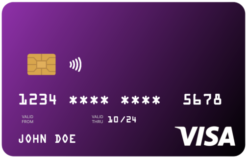
This will create a credit card user interface with the cardholder's name, card number, and validity date. For more advanced usage, see the following parameters:
| Name | Type | Description |
|---|---|---|
cardHolderFullName |
String |
The cardholder's full name. This is a required parameter. |
cardNumber |
String |
The full credit card number. This is a required parameter. |
validThru |
String |
The validity date of the card. It must be in the format "mm/yy". This is a required parameter. |
validFrom |
String |
The valid from the date of the card. It must be in the format "mm/yy". This parameter is optional. |
topLeftColor |
Color |
The top-left gradient color of the card. The default value is Colors.purple. |
bottomRightColor |
Color |
The bottom-right gradient color of the card. If not specified, a darker version of the topLeftColor will be used. |
doesSupportNfc |
bool |
A boolean value to indicate if the card supports NFC feature. The default value is true. |
placeNfcIconAtTheEnd |
bool |
A boolean value to place the NFC icon at the opposite side of the chip. The default value is false. |
cardType |
CardType |
Specify the type of the card to display. By default, the value is set to CardType.credit. You can set it to CardType.other if you prefer not to specify a card type. This is optional. |
cardProviderLogo |
Widget |
Provide a widget for the logo of the card provider. If this parameter is not set, the card will be displayed without a logo. This is optional. |
cardProviderLogoPosition |
CardProviderLogoPosition |
Set the position of the card provider logo on the card. The default value is CardProviderLogoPosition.right. You can set it to CardProviderLogoPosition.left or CardProviderLogoPosition.right. This is optional. |
backgroundDecorationImage |
DecorationImage |
Set a background image for the card. This parameter supports both asset and network images. If this parameter is not set, the card will be displayed without a background image. This is optional. |
CreditCardUi(
  cardHolderFullName: 'John Doe',
  cardNumber: '1234567812345678',
  validFrom: '01/23',
  validThru: '01/28',
  topLeftColor: Colors.blue,
),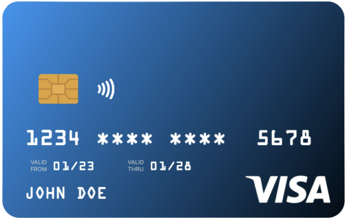
Get ready to create a sleek and stylish credit card interface with just a few lines of code! With this package, you can easily customize the cardholder's name, card number, validity dates, and gradient colors to make it uniquely yours.
By default, the card will have a chic blue gradient and an NFC icon. But don't worry, if you don't want the NFC icon, simply pass doesSupportNfc: false.
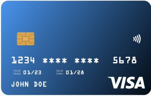
Want to switch things up and place the NFC icon on the opposite side of the chip? No problem! Just enable it by passing placeNfcIconAtTheEnd: true, but remember to also pass doesSupportNfc: true.
Let's make your app look as sleek as that shiny new credit card!
CreditCardUi(
    cardHolderFullName: 'John Doe',
    cardNumber: '1234567812345678',
    validFrom: '01/23',
    validThru: '01/28',
    topLeftColor: Colors.blue,
    doesSupportNfc: true,
    placeNfcIconAtTheEnd: true, // 👈 NFC icon will be at the end,
),
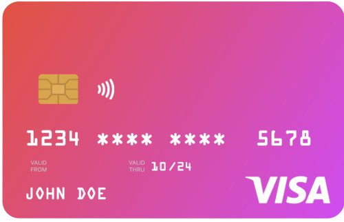
CreditCardUi(
  cardHolderFullName: 'John Doe',
  cardNumber: '1234567812345678',
  validThru: '10/24',
  topLeftColor: Colors.red,
  bottomRightColor: Colors.purpleAccent,
),
This will create a credit card user interface with a red-to-purple gradient.
If you want to scale the card, use scale: property.
If you set less than 1, the card size will be reduced, if you set greater than 1, the card size will be increased.
CreditCardUi(
  scale: 0.6, // 👈 this will make smaller than the regular size
  cardHolderFullName: 'John Doe',
  cardNumber: '1234567812345678',
  validThru: '10/24',
  topLeftColor: Colors.red,
  bottomRightColor: Colors.purpleAccent,
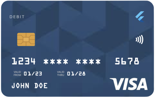
),To further customize the card, you can add a background image by using the backgroundDecorationImage property. Additionally, you can include a logo for the card provider using the cardProviderLogo property. This logo can be positioned on either the left or the right side of the card using the cardProviderLogoPosition property.
If you want to specify a particular card type to display, you can set it using the cardType property. If you prefer not to specify a card type, you can set cardType: CardType.other.
Here is an example of how to use these customization options:
Example:
CreditCardUi(
    cardHolderFullName: 'John Doe',
    cardNumber: '1234567812345678',
    validFrom: '01/23',
    validThru: '01/28',
    topLeftColor: Colors.blue,
    doesSupportNfc: true,
    placeNfcIconAtTheEnd: true,
    cardType: CardType.debit,
    cardProviderLogo: FlutterLogo(), // 👈 Set your logo here, supports any widget
    cardProviderLogoPosition: CardProviderLogoPosition.right,
    backgroundDecorationImage: DecorationImage(
    fit: BoxFit.cover,
    image: NetworkImage( // 👈 `AssetImage` is also supported
        'https://....',
      ),
    ),
),
ধন্যবাদ
There are already many credit card packages out there, but none of them look realistic. So, I've decided to create something that will look the same as our cards in real life. Additionally, this project was inspired by a Native Android library.

Utpal Barman 🇧🇩
This package is released under the BSD 3-Clause License.


